
Top 5 trends in visual branding
What trends to expect in visual branding and identity design in 2023?
I don’t like articles that tell us what trends and events we are to expect for the future. And yet I’m writing a post exactly like that—even though I can’t see the future, either, I’m really interested in this topic. Looking at it from a distance, from above, what is the current situation in visual branding and identity design and in what direction are they evolving? It is almost the end of the year, which is a good occasion to project these processes for the next year and an opportunity to give a strong and clickable title to my post.????
My observations are based on my experience with zwoelf digital, where we design visual identities every day and we see and feel the changes and how needs and demands are evolving. These changes are basically triggered by technological development. Simply put, we’re going digital.
It is easy to see from the fact that while 2-3 years ago more than half of our work went to print, now, at the end of 2021, it is less than 5-10%. Not even the elements of the ‘basic identity package’ are printed now, it is the only business card that is still standing. Other elements that used to be marginal are now becoming increasingly important, such as:
- email signatures,
- social media post templates,
- Word and PPT templates,
- PDF presentation brochures.
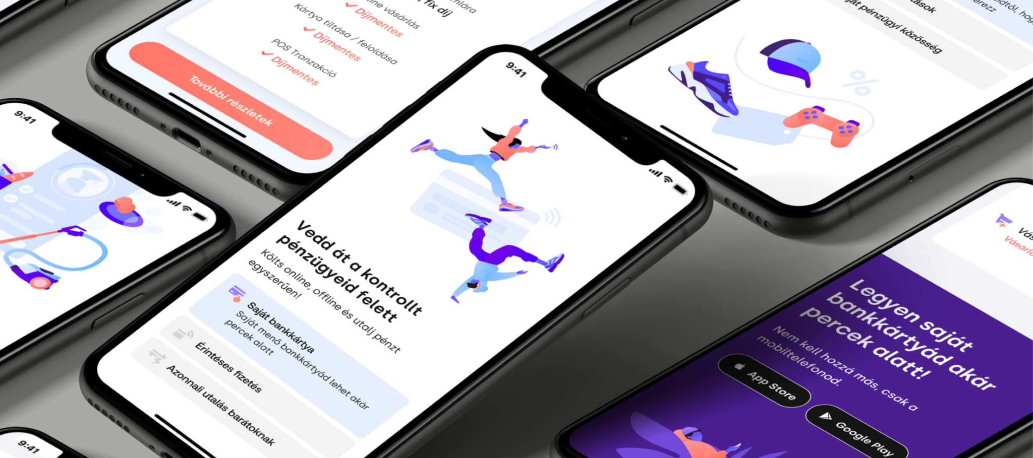
Digitisation is creating more and more interfaces on screens and digital platforms. The COVID-19 pandemic has sped this process up: the digitisation of certain services has gained speed in entertainment (online cinema, television, theatre), education (e-learning courses, webinars, conferences) and many other areas. (I, too, started working on brandguide.me during the lockdown.)
Let’s take a look at the points where digitisation affects visual branding and identity design. We could go through all the building blocks of visual identities, but I’m only going to highlight a few of them.
0. Responsivity is the word
Responsive webdesign has been around for over 10 years. The development of mobile devices brought about the need for websites to adapt to the screens of mobile phones, tablets, televisions etc. It’s not only websites that need to adapt, but also visual identities. On average, we get 3600 communication messages every day. It is a lot of noise and brands can only stand out if they sufficiently adapt to the platform, assume a suitable form and convey the right message at the right time. If you ignore this, you can’t get your message through to your target audience. What makes a responsive visual identity? It can be flexibly used, yet it is a coherent system and it can meet the needs that arise from continuous change.
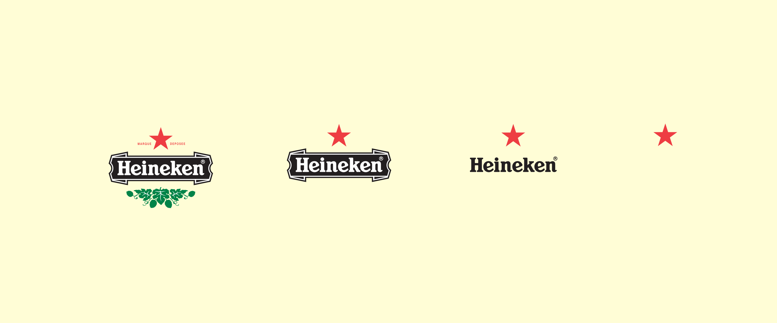
1. Changing permanence—in focus: logotypes and combination marks
The logo will always be the tip of the visual identity iceberg. A logo is not a visual identity, and a logo in itself is not a brand. A logo in itself is nothing, just one of the branding elements. Its function, however, remains the same and it has not changed in the past century: to serve as a unique, distinctive and recognisable sign. Changing permanence is becoming increasingly important–logotypes/combination marks need to adapt, with some compromises, to the requirements of the many digital and conventional platforms. All this while fulfilling the two main roles mentioned above (being distinctive and recognisable). In 2021, a fixed sign is not enough to get through your brand’s message effectively, in addition to the basic visual identity set, you need at least the following:
- a primary branding element or logo that works even in favicon size (16x16px),
- a primary branding element or logo that works in a square/circle format » avatars have square/circle frames on every social media site,
- an element that can be animated and moved (website, video, posts).

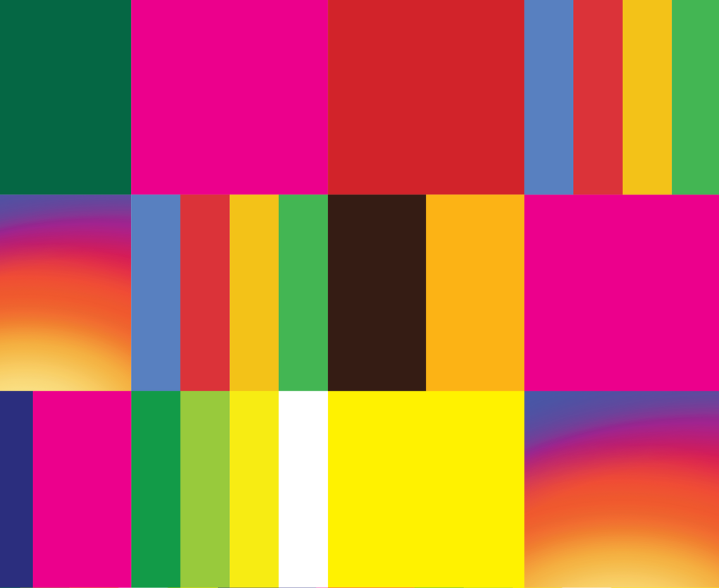
2. RGB colours—the digital golden age
At zwoelf, we are designing more and more visual identities where the primary brand colour can only be displayed in the RGB spectrum, not in the CMYK colour model. Related to this is the spread of graphics with gradients, which work well (or better) in screen design but they often don’t have the desired effect when printed. Of course in addition to the RGB main brand colour you can choose a Pantone direct colour that is close to the RGB colour, but it incurs extra production costs and it is also a technological limitation, since direct colours can’t be used in digital printing only in screen and offset printing. Despite all this, the shift to digital platforms is so significant that it is now possible to make such a decision and select a saturated bright blue/green/purple etc. colour that works well in RGB but can’t be reproduced in CMYK as a primary brand colour. What was inconceivable a few years back is now a viable option and we can expect a further shift towards digital colours.
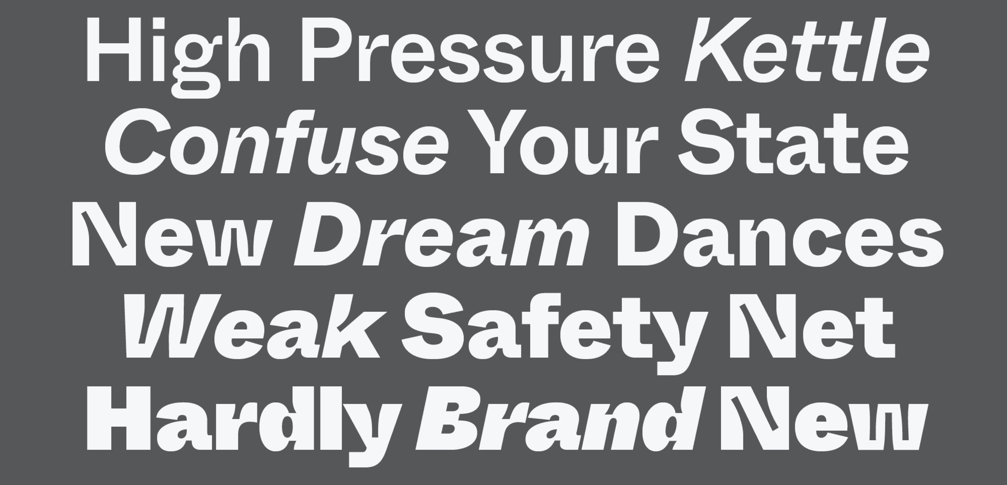
3. New excitement in typography
In recent years, it has been interesting to see the spread of sans-serif fonts. In digital space, san-serif fonts work better technically, too: the many tiny details and width contrasts of serif typefaces are difficult to display on the pixels of a screen. Also, there has perhaps never been a wider gap between the ‘intrinsic’ message of sans-serif and serif fonts. The message of innovation, digitisation and development is almost impossible to convey with serif typefaces. Of course, I’m exaggerating, there are a number of exceptions, but yet the trend is clear: digital visual identities always use sans-serif fonts.
Did use. We can feel some refreshing happening in typography. We’ve got bored with the many sans-serif fonts, and decorative elements are coming back to ease this geometrical blankness. One such – otherwise incomprehensible – trend is the spread of inktrap fonts. On digital platforms, the only function inktrap fonts have is decoration, yet they have been and still are very popular. There is a palpable need for more decoration and leaving blank design behind. We can expect this need for decoration to become even more prominent in the coming period, and this will be also supported by the development of screens—screens have higher and higher pixel density and can display more and more details.
4. Material design—to be continued
The visual appearance of a website, application or web software will continue to be inseparable from the visual identity in 2021. We’ve gotten used to large IT companies setting UI (user interface) trends in the digital world. It was Microsoft, then Apple that used to be the trailblazers, but over the past 5 years, since it introduced Material Design, the design trend(s) of Google have been dominant. Material Design was a response to flat design, which broke away from skeuomorphism overnight, and it has played a lead role ever since. Material Design gives user interfaces exactly what is needed. It is design in the best sense of the word: it solves problems, and wants nothing more and nothing less. And the regular updates aren’t self-serving, either, they contribute to ongoing and sensible development. Trends come and go, for example the neumorphic trend tried to dominate the visual appearance of user interfaces, websites and apps, but it was short-lived: if you only use decoration for decoration’s sake, it can’t result in trends or enduring design. In the coming period, a trend that builds on Material Design but is perhaps a bit more three-dimensional and ornate will come, but we will be far from the pixelporn skeuomorphism of the 2010s.
Designing social media platforms
It is still social media where the visual identities of brands are seen the most frequently. This trend seems to be getting stronger, as Facebook and the like are continuously expanding, so it will become increasingly important to control your visual identity on social media, to have cohesion and a coherent visual appearance on these sites as well.
It is no easy task, as the operators of social media sites give you little freedom. Yet if you manage this carefully and plan thoroughly, for example you design an Instagram profile page as a whole and don’t think about it as separate posts, you can achieve better and more unified results. Similarly, it is important that messages should be visually recognisable on social media. If you can grab your audience’s attention, the communication of your brand must be clearly recognisable. Visual noise is getting worse, but you can carve yourself a space if your own platforms are clear, uncluttered and scannable.
What's next?
Next year will be an exciting year. Digitisation will continue and visual identities will adapt to the new opportunities brought about by technological development. We must be familiar with these trends so that we can design dominant, enduring and valuable visual identities.
If you want to use Brand Sprint, visit our resources page, it provides you a free PDF guide to learn it—and perhaps use it in your next project, adding value to your services, or by our book which is a step by step guide to branding 👇
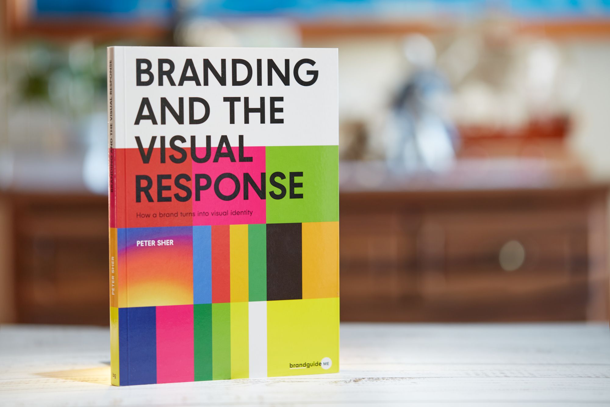
How a brand turns into visual identity
Ready to elevate your design strategy? Get this must-have book in ebook or print format. Packed with practical advice, it’s your roadmap to becoming an elite designer who thinks strategically and builds unforgettable brands.