


I remember the typography issues we had in the early 2000s, when I was working at Disney, designing and maintaining their European websites. Looking back, I can say our options in typography were rather limited.
Technological restrictions
Nowadays we can hardly imagine this, but we had about 6-8 fonts to choose from for website design. That was it. These were the systems fonts installed on every PC. At that time we could only use these pre-installed fonts:
- Arial
- Times
- Tahoma
- Georgia
- Courier
- Impact
- Trebuchet MS
- Comic Sans
- …
Of course we used some ‘hacks’. For example, we used images for headlines, but that wasn’t a SEO-friendly solution even back then. Then Cufón and the like came along, where we embedded Flash movies into websites with brand fonts that weren’t system fonts.
Then the early 2010s finally brought us webfonts. It was heaven on earth, everything became available and brands could show off all their great typography. Fortunately, this has been true ever since, we can use any font on most digital platforms. This is not true for Google Docs though, there you are limited to Google fonts, you don’t have the freedom of choice like you do on websites.
Pixel density and typography
With technological development, there are fewer and fewer restrictions in typography. The pixel density of displays is visibly increasing every year, giving us freedom to use delicate typographical details.
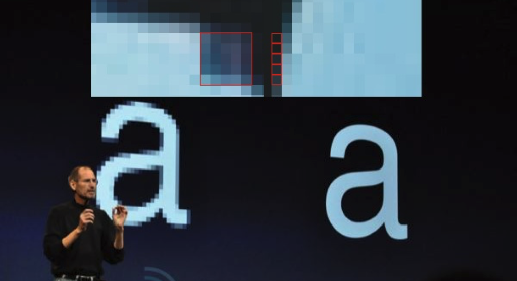
How lucky we are that Steve Jobs was a typography-enthusiast. He did everything to make sure that Mac computers would have beautiful typography.
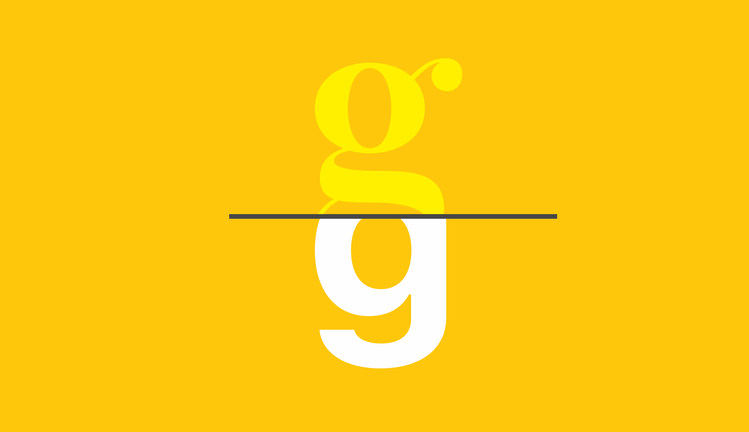
In the photo above, he is presenting the Retina display: how much more typographical details can be displayed on 4 times more pixels. It was Apple that paved the way, making it possible for quality displays to become widespread on the market. Nowadays every new smartphone screen has a high pixel density, which allows for highly detailed typography even in smaller sizes. What do I mean by highly detailed? The image below clearly shows that there are much fewer fine details on a sans-serif font and the contrast in stroke width is also smaller.
Bring on the feet
I believe the reason why sans-serif fonts were so widely used on digital platforms was the technical restrictions we used to have, especially regarding pixel density. Sans-serif fonts usually have lower stroke contrast.
It is easy to see that it makes it easier to ‘stretch’ them on the pixel grid (i.e. the pixels of the screen). As opposed to this, the great stroke contrast of modern type fonts is difficult to manage on a pixel grid: the letters simply break up.
This is why sans-serif fonts became more widespread on digital platforms and on the web. Of course there are many counter-examples, but I believe that in the past decade the web has been about sans-serif fonts.
There has long been a dispute: are serif fonts more legible because of the characteristic points created by the serifs? But it is not only serif fonts that have characteristic points that help legibility. A well-designed, less strictly geometric sans-serif font with humanist proportions is easily legible.
Perhaps this is why nobody ever complains that a website is not using a serif font. Moreover, many other factors affect legibility:
- line length
- line spacing
- letter spacing
- font size
- colour / contrast
To sum it up, it is not only the letterforms but the spacing around them that determine legibility.
Sans-serif fonts and brands
Here we can see an interesting process. Nowadays ‘digital brands’ all use sans-serif fonts as brand fonts. Maybe not all, but 99% of them surely do. If you take a look at the two giants, Apple and Google also use bespoke fonts: the former has San Francisco and the latter has Product Sans. These are both sans-serif fonts. However, it has not always been the case, both companies used serif fonts at some point.
This sans-serif trend has affected all tech companies, there are hardly any start-ups in the Silicon Valley that use serif logotypes. Surely, if you are looking, you will find some, but those will be the exceptions that prove the rule.
Where is it going, what will be the trend?
In summary, we can see that technological development now allows for a more widespread use of serif fonts. However, as trends always change over time, we can expect to see more and more serif fonts used in the near future. There have already been some forerunners. Designers are getting bored with the sterility of sans-serif fonts and are looking for some excitement. One example is Figma.com—while it is not a serif font they use, they have gone in a new, decorative sans-serif direction and are following the inktrap trend. While I have no idea what inktrap has to do with digital letters, it is an interesting attempt to stand out.
I expect great changes in the coming year in the spread of serif fonts, both in UI design and in branding. What is your opinion? Can you feel the winds of change?