
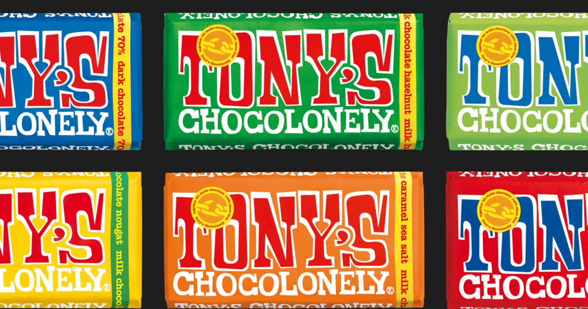
The Tony's Chocolonely logo
The creative director of Tony's Chocolonely recently blew up the internet with a post about their logo that makes Tony's stand out on another front. Find out what caused the huge response and what makes the Tony's brand so special!
How a brand turns into visual identity
Ready to elevate your design strategy? Get this must-have book in ebook or print format. Packed with practical advice, it’s your roadmap to becoming an elite designer who thinks strategically and builds unforgettable brands.
I don't think everyone is familiar with Tony's, so here's a little introduction:
- Tony's Chocolonely is one of the biggest Dutch chocolate brands. Well, it's not Belgian, it's Dutch! It's Dutch, like cocoa, but that's another story.
- Tony's is only 13 years old, but it is already the number one domestic chocolate brand in the Netherlands.
- Voted the most sustainable Dutch brand by Dutch consumers in 2022, they put a huge emphasis on sourcing their ingredients from the right place, and the chocolate is packaged in a slick, breath-thin tinfoil and paper wrapper.

The company is (unfortunately) special because of its total rejection of slave labour and child labour in the cocoa bean fields.

The inside
Tony's is by no means a traditional chocolate: for one thing, it's one and a half times the size of a standard, humble chocolate bar, which makes it very difficult to break into pieces when eating, you have to work for it, and you have to expect that no two bites will ever be exactly the same: the bar is not arranged in even cubes, but all over the place. Tony's is like that, and that's what makes it good. If you've ever tried it, you'll understand exactly.
Not every frame of the board contains the logo, as with most brands, but a large and proportionally huge edible logo is drawn. The chocolate also features a circular "cube" depicting a broken chain, a reference to the company's primary anti-slavery mission.

The outside
Tony's doesn't come in a huge variety of flavours: salted almond, salted caramel, honey-nugget almond, hazelnut, natural dark chocolate and natural milk chocolate. The latter was their first chocolate and they slowly started to introduce the others.
That's how Tony's milk chocolate became the brand logo: and no, it's not the writing on the milk chocolate that's the logo. The milk chocolate is the logo. The logo is a photograph, a scanned bar of chocolate. The product is the logo.

Arjen Klinkenberg, the company's creative director, wrote at length on LinkedIn about the tweet, saying:
Why is it that almost all logos are vector-based, monochrome word pictures? Why is it not photographic? Why aren't they 3D? Why are they not animated? Why are they so constrained in their thinking, why does it have to be recognisable even by fax? Tony's exists to challenge the industry norms of chocolate making, and we are equally challenging the design and branding industry.
He also wrote that they would like the brand not to be an elevated, fictitious existence, but the product itself to serve as a point of identification, and if frontal, to come face to face with the customer, the product, just in the form of a logo.
At every level, Tony's Chocolonely is a super example of why it can be worth breaking with tradition, why it's good to be brave and bold as a company. Good causes are usually rewarded, especially when they get chocolate in return.
How a brand turns into visual identity
Ready to elevate your design strategy? Get this must-have book in ebook or print format. Packed with practical advice, it’s your roadmap to becoming an elite designer who thinks strategically and builds unforgettable brands.