
The disappearing diversity of logos
There is an increasing trend in the world of logos towards simplicity – sans-serif fonts are getting popular and are widely used by brands. But doesn’t this mean that originality will be lost? Will logos be all too similar? Why are sans-serif fonts so popular?
The disappearing diversity of logos
Revolut changed its logo in 2020 in what we can only call a complete overhaul of the brand. They discarded their outlined, playful blue font that looked almost like Comic Sans, and used classic black and a sans-serif font.
How a brand turns into visual identity
Ready to elevate your design strategy? Get this must-have book in ebook or print format. Packed with practical advice, it’s your roadmap to becoming an elite designer who thinks strategically and builds unforgettable brands.
The invasion of sans-serif fonts
And they are not alone. The trend first started in 2017-2018, mostly in the fashion industry, when established, prestigious brands started to use simple wordmarks instead of their somewhat complicated yet special logos. Just think about Burberry, which dropped its equestrian knight logo (now it’s in use again), and chose a sans-serif wordmark. The logos of most fashion brands are now big and bold, with few exceptions in the high-end segment.
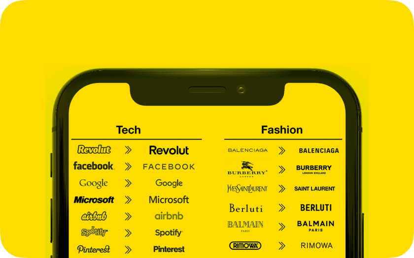
The dynamic we see at tech giants is similar: for example the Google logo is also getting simpler. Ebay, Pinterest and Spotify also let go of their special, interesting fonts and joined in on the sans-serif trend.
However, unlike fashion brands, tech companies have kept colours:
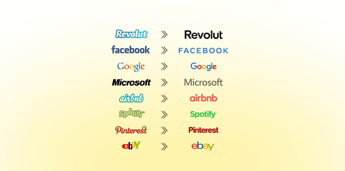
We mostly use the services listed above on our phones, maybe this is the reason these brands kept the colours: when you want to find an app quickly, you look for its colour – when you need Facebook, you search for blue.
This is what the logos of fashion brands and tech companies would look like without colours:
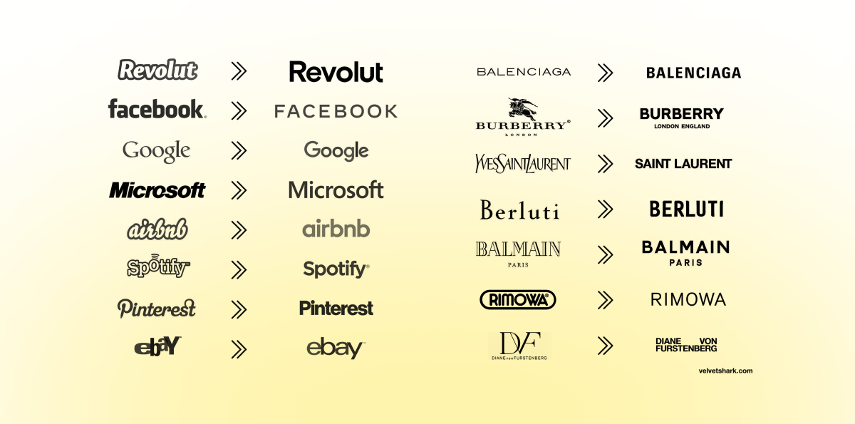
While some fashion brands monopolize whole colours, there is no such trend with logos. Anyway, it’s surely easier to place the new Burberry wordmark on clothes than the pervious one with the horse and whatnot.
Where does this font come from and what is it anyway?
Serif is the small line or stroke attached to the end of larger strokes, and sans means without in French, hence the name.

Serif fonts, by nature, allow for more differentiation in design, as you can move these strokes in various directions, you can have them rounded or angular, curved or asymmetrical.
In the short term, sans-serif fonts are easier to read, but in longer texts serif fonts are better, as serifs help the eye follow the lines. One disadvantage of sans-serif fonts is that they are less distinguishable.
Would you like to delve deeper into the relationship between brands and visuals? Get the book now! 👇
How a brand turns into visual identity
Ready to elevate your design strategy? Get this must-have book in ebook or print format. Packed with practical advice, it’s your roadmap to becoming an elite designer who thinks strategically and builds unforgettable brands.
The history of sans-serif
Sans-serif fonts were first used in 1816. They soon became popular in advertisements and on packaging. As they were mostly used in commerce, lower case letters were not common. San-serif fonts were popular in Victorian England, too, and were preserved mostly on gravestones.
Serif fonts were used in printing, as sometimes the letters printed in ink were incomplete. With serif fonts, deficient words were more legible, because the serifs made the letters bigger and more likely to have at least some parts.
Possible reasons for the sans-serif trend
- Utility
It’s important that you should be able to use a logo almost everywhere. Sans-serif fonts are clear and legible, and can be adapted well to online platforms. With these fonts, brands can be creative when designing the environment in which the logo is placed.
A potential disadvantage is that brands get too far from what they stand for. If the immediate environment of the logo can be anything, doesn’t that mean that what was associated with the brand, what characterised and identified it is now lost? - Simplicity
New companies want to stand out: one potential goal is to be loud, to show that it is revolutionary in everything it’s doing. However, established brands may try to expand their audience by moving towards uniformity, as simplicity is not something that gets a lot of criticism. The question is, if it is profitable in the long term to be one of many. - A brand is more than just its logo
It’s not just the logo that drive sales, it’s also the service the company provides. The key is to create an identity with the service itself as an integral part; an identity that suits the role of the company and suits its activities. The brand is a package. Its visual representation is the logo, which can embody the essence of the brand. Emphasis on ‘can’.
If you liked this content, subscribe now 👇