Sweden's unique typeface
Increasing numbers of cities and countries are opting for a unified identity in their communication efforts. At the national level, the Swedes stand out for developing their unique font.

More and more cities and countries are choosing to use a single identity for their communication. Great examples are around us. On a country level, it is the Swedes who have gone so far as to create their own font.

Let's take a look at Sweden Sans.
Sweden Sans
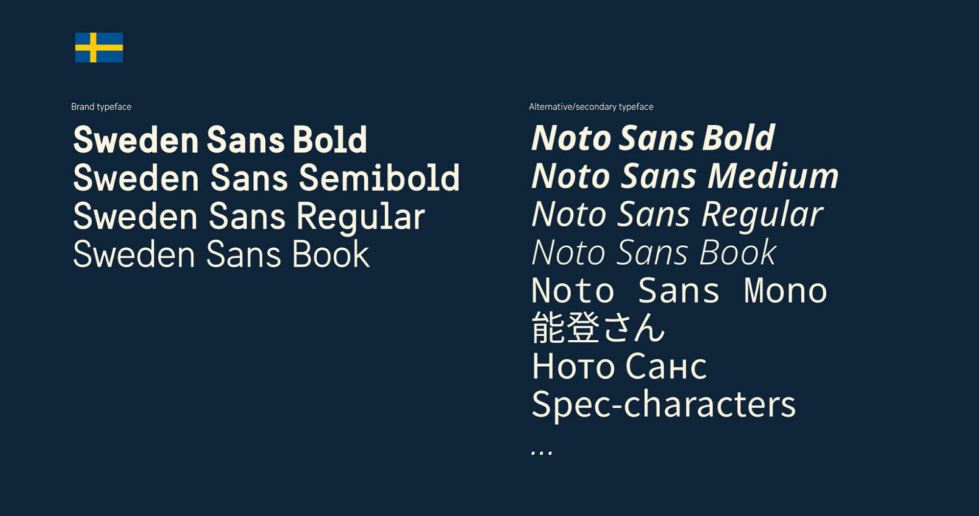
Sweden Sans is Sweden's primary font. It is used in all their communications, and over time has become easily recognisable to citizens and interested foreigners. It is inspired by Sweden's old lettering systems. It has a typical Nordic simplicity and minimalism, which in this case manages to remain perfectly authentic. Easy to read, easy to use.
The four types of Sweden Sans depend on the hierarchy of the text: Bold is for headlines, and Book is for the very basic paragraphs, whole texts. Regular and Semibold are used for subheadings and short slogan-like texts: for example, in a prologue.
Noto Sans is used as an alternative or supporting font: it is not used by Sweden with any great frequency, for fear that Sweden Sans would lose its importance. However, non-Latin alphabets and special characters are often better represented, so it comes in handy.
Would you like to deep dive into the visual world of brands? I warmly suggest to check my bookon how visuals support branding: Branding and the visual response book 👇

How a brand turns into visual identity
Ready to elevate your design strategy? Get this must-have book in ebook or print format. Packed with practical advice, it’s your roadmap to becoming an elite designer who thinks strategically and builds unforgettable brands.
