Pirate branding
Is branding something pirates already did?
Yes, most probably, though they were not aware of it. British naval records show that the first pirate to use the flag with the skull, the Jolly Roger, as a symbol was Emanuel Wynn in the 18th century. It was described as a black flag with a white skull and crossbones and an hourglass. Nowadays the symbol does not include the hourglass, but it sent a strong message back then—you don’t have time to flee, your time will be up. Cruel, isn’t it?
As early as Roman times, bones and skulls were used to symbolise death and the fact that we all die eventually. Before the 18th century, the crossbones and the skull were used as a symbol of the crucifixion of Christ, but when pirates started to use it, Christian culture let go of it and didn’t use this symbol anymore.
The Jolly Roger flag of the pirates quickly became widespread on the seas, and its message was universal. It was an explicit visual sign and a direct message to the other ships. The analogy with branding is clear, it ticked many boxes that brands today need to tick:
- to distinguish you,
- to position you among the ships,
- an easy-to-remember/easy-to-recall sign,
- to have a clear message,
- to trigger emotions.
The flag was useful for the pirates as they could get their message through to their target quickly and effectively—get ready, we are coming! The target had two options: to fight or to surrender. The pirates wanted the latter—to get the booty with as little fight as possible and as soon as possible after the ‘signal’ was sent. The targeted ship hastily prepared to quickly hand over the goods to the pirates. If the crew resisted, the pirates could assess if it was worth the confrontation, how much they could lose while plundering the ship. They used the flag to be more effective and it was also a sign of brotherhood among the pirates.
In addition to signs, pirates also used colours in their communication. The black and white flag meant that if they were given the booty, they wouldn’t hurt the crew. If, however, they raised a red flag, they spared no-one on board.
Branding tries to be similarly effective: the visual sign communicates ‘from afar’, it sends a message and, what is even more important, it evokes and conveys emotions, connects those who use the sign and gathers them in a tribe. Just think about it: a ship is coming towards you at sea and all of a sudden it raises the pirate flag. What feelings come over you?
Alarm, dread and horror. Not at all pleasant, that’s for sure. The sight of the pirate flag triggers terror and dread—brands work in a similar way, while of course today’s brands mostly try to trigger positive emotions.

The sign has remained the symbol of danger for centuries, and it is still in use to mark objects that are dangerous to people.
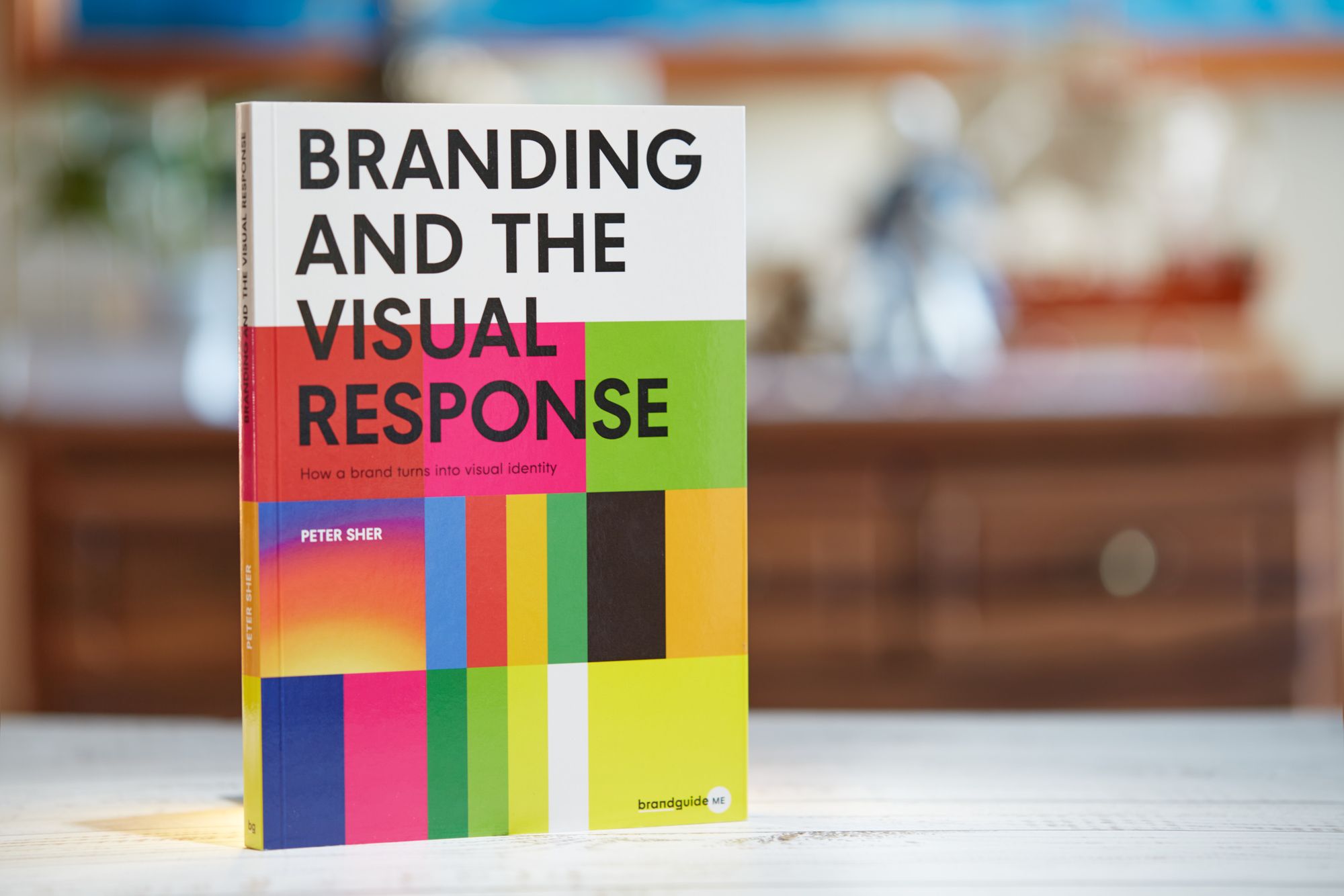
If you want to use Brand Sprint, visit our resources page, it provides you a free PDF guide to learn it—and perhaps use it in your next project, adding value to your services, or by our book which is a step by step guide to branding 👇

How a brand turns into visual identity
Ready to elevate your design strategy? Get this must-have book in ebook or print format. Packed with practical advice, it’s your roadmap to becoming an elite designer who thinks strategically and builds unforgettable brands.
