Digital branding – favicon is the new fax

The digital branding process is quite different from conventional visual branding. Digital media and digital brand design require a different mindset from the designer, this is something we must adapt to.
A basic visual identity package is not the business card+letterhead+folder (…) package any more. We print less and less, we have digital documents and use email for correspondence, our communication channels are increasingly digital. And there are the social networking sites. These are the new platforms of digital brands.
As part of the visual branding process, we test the logo and the branding elements on different platforms at concept level. These are just drafts, and we later use these to develop the visual identity. While we used to test these mostly on office stuff like business cards and letterheads and on larger surfaces used for marketing like rollups and car decorations, nowadays we turn to digital platforms instead and test display ads, email signatures, etc. In digital design the ratios are different and it’s important for a designer to have experience with this, too. It’s often said that you can tell when it was a ‘print’ graphic designer who created a digital design.
Let’s take a look at the main digital brand platforms:
- website
- application
- basic visual identity package
- ad
- social media
Digital era
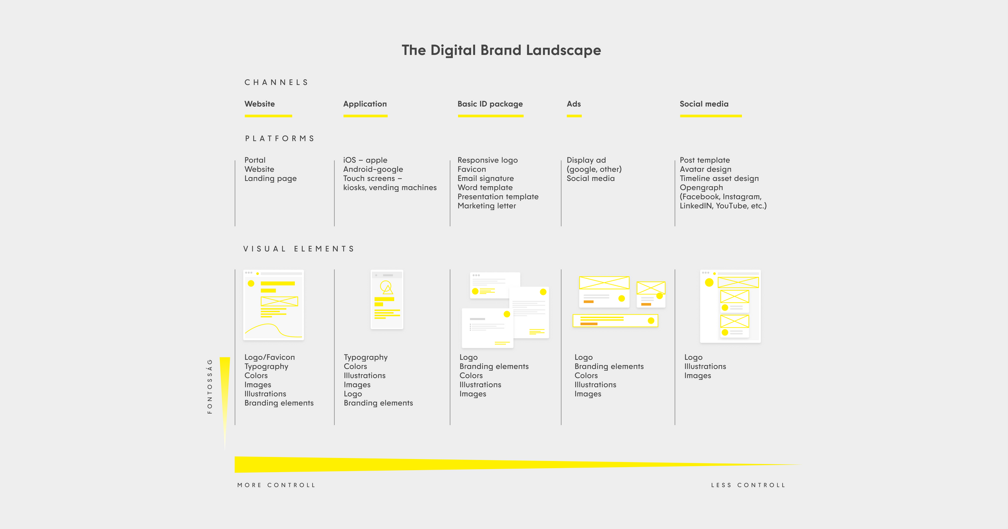
At zwoelf we have an increasing number of clients who only use digital communication channels. Often their products are digital, too, so their primary platform is their own website. The figure below provides a summary of the Digital Landscape with a list of these digital media.

There are digital platforms where you have full control, like your own website, and there are platforms where there are limitations as they are controlled by the platform itself, like in social media. The figure above lists the elements of a brand for each platform, in order of importance. These elements include:
- logo or combination mark
- typography
- colors
- branding elements: images
- branding elements: graphics
Let’s take a look at these elements and their characteristics as they go digital.
To logo or not to logo
Logos are getting less and less significant in digital branding (too). It doesn’t mean a brand doesn’t need a strong logo or combination mark, because it does, but flexible visual identities built around the logos are increasingly important as there are more and more types of digital platforms. The logo as the lead character is losing its steam, and now the supporting actors are coming to the fore. If the visual identity is strong enough, you can take the logo away and the brand will still be recognizable.
And logos now need to be more flexible than ever. The term ‘responsive’ is mostly used in webdesign, but we use it more and more for logos as well. Responsivity means that a logo must be adapted, in size and technology, to its environment, to the platform where it appears, and this determines the maximum message it can convey on a given platform.
There are brands that don’t need a sign-like logo. This is true for mature brands that tend to get simpler over time, like the Starbucks logo. However, the opposite is also true: an app must have a logo for the single most important place where it appears, the app icon.

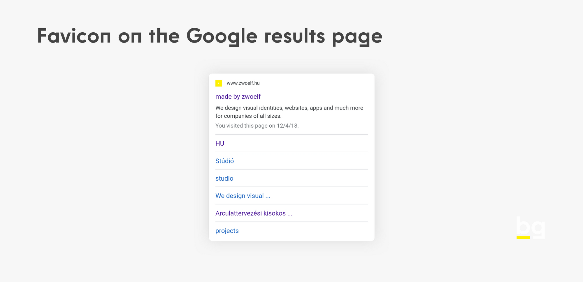
And there is more. Favicon is the new fax, says the subtitle. Until the 90s, while fax was still in use, the usability of a logo depended on whether it worked in monochrome, as this was a technical limitation when sending a fax. Today there is a new requirement: is the logo suitable for website favicons? This is a very small, 32×32 pixel image that typically appears on browser tabs. Since the 23, the favicon is displayed on both desktop and the mobile version of the Google search results page, which has made this little image so much more important – this is a new, free opportunity, don’t miss it.
Typography
In typography, the greatest improvement is the spread of webfonts. With webfonts it is now possible to use any font on digital platforms: previously only system fonts could be used here, now technically any font can be used online.
Not all is well, though, as in the basic digital visual identity package the use of individual fonts is still limited: the use of brand fonts is still not always possible in email and electronic documents, meaning brandbooks must still include a fallback font, unfortunately.

Colors
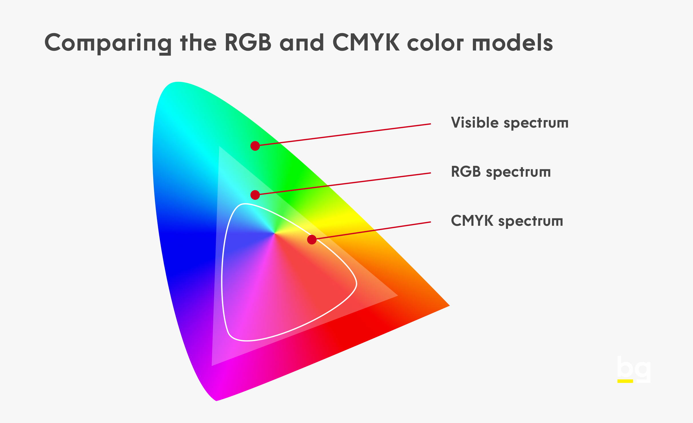
There are limitations with colors, too. The CMYK (print) color model is narrower the RGB (screen) model, there is no full correspondence between the two. Considering this, relying on digital design can be risky: while a lively blue, purple or a neon green tint can have a strong effect on the screen, the same colors can only be printed in a dimmer, duller version in the CMYK color model. A possible solution is to use direct colors, but that increases costs significantly.
Branding elements
Branding elements include any and all visual elements besides the logo that add to the visual identity. Typically this is a flexible system of a number of images and graphic branding elements. By images I mean photos, raster format images that represent the brand. There is a wide range of graphic elements, including secondary branding elements, icons, illustrations, etc. In case of online products and applications, it is illustrations where the brand has the most pronounced appearance (onboarding, empty states, placeholders).
Digital future
Every day there is a new platform we can use to communicate our brand. We have a number of visual tools to add visual content to these platforms. Specialists must take up this challenge if they want to deliver quality. I hope this piece will help you with that.
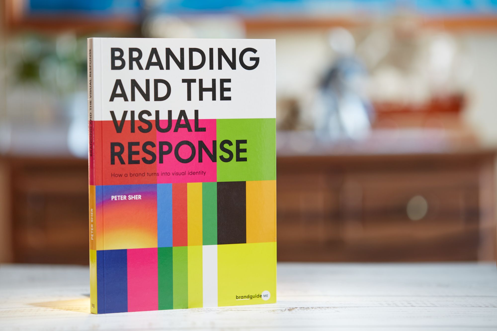
If you want to use Brand Sprint, visit our resources page, it provides you a free PDF guide to learn it—and perhaps use it in your next project, adding value to your services, or by our book which is a step by step guide to branding 👇

How a brand turns into visual identity
Ready to elevate your design strategy? Get this must-have book in ebook or print format. Packed with practical advice, it’s your roadmap to becoming an elite designer who thinks strategically and builds unforgettable brands.
