IKEA: change and permanence

Back in April 2019, the IKEA logo changed. At this time I was moving to a new apartment and I often visited the IKEA stores, but I’m not sure I would’ve noticed if I hadn’t read about it.
It wasn’t a fundamental change, more like a facelift or optimisation, but I think it’s worth discussing as we can all learn from the story IKEA tells us.
Let’s take a look at the IKEA visual identity first, then we can explore the 2019 refresh in detail. Ready? 🚀

The logo as the centre of the visual identity
The visual appearance of IKEA doesn’t change often. Basically, this is the third form of the IKEA logo since the company was established in 1943. The first two were stylised quality stamps, then there was a switch in 1963 and the concept has not changed since—there is an ellipse placed in a rectangle with the word IKEA inside, written in uppercase. It is this trio that was refined this year, but let’s not rush ahead. ☝️

Carefully chosen colours
The current brand colours were introduced in 1983. Blue and yellow are primary colours that work well. If we take a look at the meaning of these colours, we can also see they were carefully selected: blue represents reliability and trust, and yellow adds happiness, optimism and openness, resulting in a balanced combination. Not to mention that these are the colours of Sweden, the home of IKEA.

Democratic typography
A recent and spectacular change was the change of the brand font. I still remember the day when, in 2009, I saw the new font, and I must admit I wasn’t happy that IKEA switched from the Futura font (tailored to IKEA’s needs by Robin Nicholas) to Verdana. This was still before webfonts, when there were limited options for font use in webdesign, so we often used Verdana, one of the basic typefaces in Windows, which has since become free for everyone.
I couldn’t understand the reason for the switch.
Then I realised what a genius decision it was. Now in hindsight, after 10 years, this font switch represents all the values of the IKEA brand: Openness, accessibility, economy and reasonableness.
The switch only had benefits:
- a well-designed font set—designed for Microsoft, by none other than Matthew Carter
- available on every computer through the Windows and OSX operational systems
- suitable for print and digital media
- comprehensive language and character support
‘Verdana is a simple, cost-effective font which works well in all media and languages’
— Camilla Meiby (spokesperson of IKEA, 31 August 2009)
For multinational and global companies, buying and managing a unified brand font that is globally available is an enormous challenge. Nowadays the most effective solution is probably to have a unique brand font designed, but if you want to have a unified appearance on the web, in apps and print materials, it is expensive, not to mention that you need several alphabets from Arabic to Korean.
Here lies the genius of IKEA. In 2009, Verdana was an overused font. It was not in the least unique. This is why I didn’t understand why they let go of the distinctive Futura typeface. However, this has changed over time, and now, 10 years later, no-one uses Verdana – why would they, when there are 10,000 uniquely designed fonts that represent their brand better. IKEA, on the other hand, now has a unique font set that is globally available for free. If it was a strategy, it was a very clever one, but perhaps it was a stroke of luck—which you also need every once in a while. 🤩
To tell the whole story meanwhile IKEA changed it's main typeface to a more accessible free font: Noto.
Talking about typography, the word IKEA in block letters is also part of the logo, obviously. It looks like an ultrabold Futura with small serifs, but I’ve found no information on this, so it is probably a unique letterform.

2019: the year of invisible change
Now that we are familiar with the IKEA logo, the basis of the company’s visual appearance, let’s talk about the change that came this year.
The brief is available online, and its 4 main points are:
- to redraw the logo to improve legibility
- to optimise the logo for digital and print use, both in small and big size
- to have only as much change that the logo doesn’t have to be patented again
- the two logos will be used parallelly for a while, so there should be no discord between them
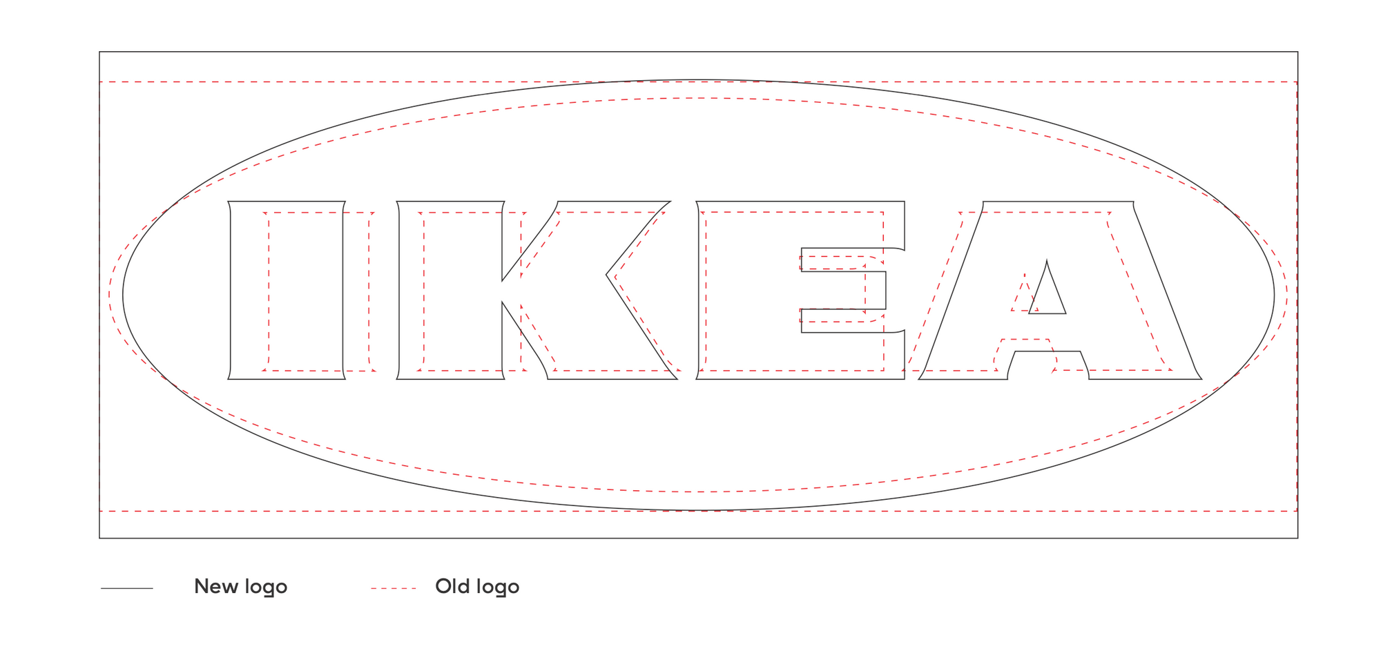
A Swedish and a Dutch studio were commissioned with the job. Keeping the basic geometrical elements mentioned earlier, the proportions were refined, and it naturally meant that the typography was also changed: the serifs got smaller, now we could say it is almost a sans-serif font.
As a result, with the area unchanged, the size of the word IKEA got 15% bigger, ensuring better legibility and recognisability in smaller sizes. This also means that with the size of an ad unchanged, the word is 15% more prominent. Just think about the huge triangular IKEA totems along motorways: you can now read them from 1150 m afar, not just from 1 km. 😎
Joking aside, how did they do it? For a given width, the logo became taller, so the ellipse became taller, too. With these changes, higher typographical elements could be used without a crammed effect. The logo is now more compact as the ® sign is also within the frame.
Conclusion
It was interesting to see that if the result of your work is not conspicuous visually, how the client, the professional community and the general public will feel about it. Members of a Hungarian, supposedly professional Facebook group collectively laughed at the new IKEA logo. Yet if you see what the requirements were, what objective the client had with the changes, it will be clear why some seemingly unnecessary steps were taken. IKEA currently has 367 stores in 30 countries. The logo appears on countless surfaces, and with this 15% growth, it became 15% larger and more legible on all of them.
If you want to use Brand Sprint, visit our resources page, it provides you a free PDF guide to learn it—and perhaps use it in your next project, adding value to your services, or by our book which is a step by step guide to branding 👇

How a brand turns into visual identity
Ready to elevate your design strategy? Get this must-have book in ebook or print format. Packed with practical advice, it’s your roadmap to becoming an elite designer who thinks strategically and builds unforgettable brands.
