


Quick takeaways
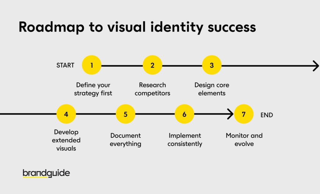
Before we get into the fun stuff, here’s your roadmap to visual identity success:
Define your strategy first – Think before you design (I know, I know, but trust me on this one!)
Research competitors – See what’s out there so you can stand beautifully apart
Design core elements – Create your logo, colors, and fonts with real purpose behind them
Develop extended visuals – Build the supporting cast that makes everything sing together
Document everything – Create guidelines that actually help (not intimidate!)
Implement consistently – Show up the same amazing way everywhere
Monitor and evolve – Keep growing and getting better, just like any good relationship
Now let’s explore each step with the kind of detail that actually helps you create something special.
Understanding the foundation of visual identity
What exactly is visual identity?
Picture this: visual identity is like your brand’s outfit, body language, and smile all rolled into one. It’s how people recognize you before you even introduce yourself – pretty powerful, right?
While your complete brand identity includes everything from your values to how you answer the phone, visual identity is specifically about all the visual pieces that represent you in the world. Before we go deeper, it’s important to understand what is a brand at its core—the promises, perceptions, and experiences that define you in the minds of your audience.
Think of it as your visual vocabulary: your logo (your signature), color palette (your emotional tone), typography (your speaking voice in written form), imagery style (your way of showing rather than telling), and all those lovely supporting elements like patterns and icons that add personality.
I remember working with this brilliant tech startup that couldn’t figure out why potential customers kept sliding right past them. Their product? Absolutely fantastic. Their visual identity? Well, imagine if someone showed up to every meeting wearing a different costume – confusing, right? Once we created a consistent visual language with thoughtfully chosen visual assets, it was like watching someone finally find their perfect outfit. Recognition went through the roof, and more importantly, customers started connecting with the feeling of the brand.
Why visual identity matters for your business
“But wait,” you might be thinking, “my product is amazing – surely that speaks for itself?” Oh, sweet friend, let me tell you why that visual magic matters so much:
Brand recognition works faster than you think. Our brains process images 60,000 times faster than text (wild, right?), so your visual identity is literally the express lane to being remembered in a world where people see thousands of brand messages every single day.
Differentiation is your secret weapon. When every tech company is swimming in shades of blue, being thoughtfully different isn’t just nice – it’s necessary. I love working with brands who dare to zig when everyone else zags.
Trust building happens through consistency. When your website feels like it’s best friends with your business card, and your social media looks like it went to the same design school as your packaging, people think, “These folks have their act together.” And that, my friend, builds trust faster than any testimonial.
Emotional connection is where the real magic happens. Colors whisper feelings, shapes suggest personalities, and imagery tells stories. Understanding why branding is important goes beyond just aesthetics—it’s about creating meaningful connections with your audience that drive real business results.
One of my favorite success stories? A family bakery that was doing everything right except looking the part. When we refreshed their visual identity to showcase warmth, tradition, and genuine craftsmanship, sales jumped 35% in the first year. Same delicious cookies, but now people could feel what made them special just by looking at the brand.
Step 1: Define your brand strategy before designing
Clarifying your brand purpose and values
Here’s where I see so many eager entrepreneurs stumble: they skip straight to the pretty pictures without understanding what their brand actually stands for. Please, please don’t do this to yourself!
Your visual identity should be like a mirror that perfectly reflects your brand’s soul. Without knowing what you’re trying to reflect, you’re just making decorations, not strategic design decisions. Learning how to establish brand identity begins with understanding your core purpose and values before any design work starts.
Let’s get cozy with some essential questions:
- Why does your brand exist beyond making money? (And “to be successful” doesn’t count!)
- What problem do you solve that makes people’s lives genuinely better?
- What values guide how you show up in the world every day?
- What makes your approach uniquely you compared to everyone else?
Write these answers down somewhere you’ll actually look at them – they’re going to be your north star for every visual choice ahead.
Try crafting a simple brand purpose statement that captures why you exist and who you’re here to serve. For example, a sustainable clothing brand might say: “We create timeless, ethical fashion that helps environmentally-conscious people express their personal style without comproming their values.”
See how that immediately suggests certain visual directions? Natural colors, clean design, transparency. It also rules out flashy trend-chasing or artificial-feeling elements. That’s the power of strategy-first thinking!
Understanding your target audience
Here’s a truth that might sting a little: your visual identity isn’t for you – it’s for the people you’re trying to serve. And that’s actually wonderful news, because it takes the pressure off your personal preferences and puts it where it belongs: on what truly resonates with your audience.
I can’t tell you how many talented business owners I’ve worked with who created visual identities they absolutely loved, only to discover they completely missed the mark with their actual customers. Your taste matters, but your audience’s connection matters more.
Let’s create some detailed audience personas that include:
- Demographics (age, location, income – the basic facts)
- Psychographics (values, interests, lifestyle – the juicy stuff!)
- Visual preferences (what brands do they already love and engage with?)
- Pain points and dreams (what keeps them up at night and gets them excited?)
If you’re targeting busy young professionals with a premium food delivery service, your visual identity might whisper sleek efficiency and quality. If you’re reaching families with little ones, you might focus on playfulness and safety cues that make parents smile.
Remember, different generations have completely different visual languages. What makes Gen Z stop scrolling won’t necessarily catch a Baby Boomer’s eye. What appeals to corporate executives might make creative professionals run for the hills. Know who you’re talking to, and design with their eyes, not just your own.
Step 2: Research your competitive landscape
Analyzing competitor visual identities
Before you can shine in your own unique way, you need to understand the stage you’re stepping onto. Competitive analysis isn’t about copying what works (please don’t do that!) – it’s about understanding the visual conversation already happening so you can add your own distinctive voice.
Start by gathering your 5-10 main competitors and take a good look at their:
- Logos and visual marks
- Color palettes and how they use those accent colors
- Typography systems (fonts have personalities too!)
- Photography style and imagery choices
- Overall visual vibe (playful, serious, luxurious, minimalist, etc.)
Look for patterns and trends. Are there industry “defaults” that everyone seems to follow? Financial services and their blue obsession, anyone? Or organic food brands and their love affair with green and earthy tones?
I once worked with a fitness app that initially wanted to follow the crowd with bright yellows and greens. But when we mapped out the competitive landscape, we realized this was actually a golden opportunity to stand out. We chose a sophisticated navy and coral palette that signaled premium quality and helped them break free from the pack in all their marketing efforts. Sometimes the best move is the one nobody else is making.
Finding your visual differentiation
Once you understand what everyone else is doing, you can spot the gaps and opportunities for meaningful differentiation.
If everyone in your space is speaking in minimalist whispers, maybe a more expressive approach would help you stand out. If competitors are all using photography, perhaps illustration would be your distinctive choice. If they’re all playing it safe with traditional typography, modern or custom fonts might be your secret weapon.
Understanding the various types of branding can help you identify unique approaches that might work perfectly for your specific industry and audience.
The key is finding differentiation that’s both distinctive AND authentic to who you are. Don’t be different just for the sake of being different – be different in a way that reinforces what makes your brand genuinely special.
Try creating a simple positioning map with two axes that matter in your industry (maybe traditional-modern on one side and budget-premium on the other). Plot where competitors live, and look for that sweet, unclaimed territory that aligns perfectly with your brand strategy.
Step 3: Design your core visual elements
Creating a memorable logo
Your logo is the cornerstone of your visual world – think of it as both the face of your brand and the foundation everything else builds upon. A great logo works hard in small spaces and looks just as confident on a billboard.
Let’s explore the different types you might consider:
- Wordmarks: Your brand name styled beautifully (like Google or Coca-Cola)
- Lettermarks: Using initials or abbreviations (think IBM or HBO)
- Symbols/Icons: A standalone graphic that represents you (Apple’s apple or Twitter’s bird)
- Combination marks: Text paired perfectly with a symbol (Adidas or Burger King)
- Emblems: Text nestled within a symbol (Starbucks or Harvard University)
The right choice depends on your brand name, industry, where you’ll use it, and what resonates with your target audience. A long or complex name might love an abbreviation or symbol, while a new brand often needs the name recognition that comes with a wordmark.
Here’s where I’m going to lovingly insist: work with a professional designer or branding agency. And I’m not just saying that because I am one! Logo design requires specialized skills in concept development, typography, color theory, and technical execution that go way beyond knowing how to use design software.
When you brief a designer, focus on the strategy and feeling you want to convey, not specific design directions. Instead of saying “I want a blue logo with a mountain,” try “We want to convey reliability and adventure to our outdoor-enthusiast audience.” See the difference?
Also think about versatility early. Your logo needs to work across many applications:
- Different sizes (from billboard to tiny favicon)
- Different formats (print, digital, embroidery, engraving)
- Different backgrounds (light, dark, busy)
- Black and white versions
- With and without taglines
In my book Branding And The Visual Response, I dive much deeper into the logo creation process, including specific exercises to help you develop something truly distinctive.
Establishing your brand color palette
Colors aren’t just pretty choices – they’re psychological triggers that create instant emotional responses and associations. Your brand color palette might just be your most powerful tool for recognition and connection.
Understanding the psychology and science behind colors for branding is essential for making strategic choices that align with your brand’s personality and goals.
A strategic color palette typically includes:
- Primary brand color(s): 1-2 main colors that define who you are
- Secondary colors: 2-3 supporting players that add flexibility
- Accent colors: 1-2 colors used sparingly for emphasis or calls to action
- Neutral colors: Grays, whites, or tans that support the whole system
When selecting colors, think about:
Color psychology – Different colors create different feelings. Blues suggest trust and reliability, reds create excitement or urgency, greens connect to nature and growth, purples convey luxury or creativity. It’s like having an emotional vocabulary at your fingertips.
Industry context – Some colors have strong industry associations. Using them signals you belong to a category, while breaking conventions can signal disruption. Just make sure it’s intentional!
Cultural implications – Colors mean different things across cultures. Red signifies luck in China but can represent danger in Western contexts. Know your audience.
Accessibility – Will your colors provide enough contrast for everyone to read easily? Can color-blind users distinguish important elements? Inclusive design is always good design.
Practical magic – Can your colors be reproduced consistently across digital and print? Do they work beautifully on different backgrounds?
Beyond individual color choices, the relationships between your colors matter enormously. They should work together harmoniously while providing enough contrast for functional, beautiful design.
Don’t forget to document your colors with specific values for different uses (RGB for digital, CMYK for print, Pantone for specialty applications, and HEX codes for web).
Selecting brand typography
Typography is often the quiet hero of visual identity – the fonts you choose and how you use them have an enormous impact on your brand’s personality and how clearly your message comes through.
Choosing the right fonts for branding requires careful consideration of both aesthetic and functional qualities that align with your brand’s personality.
Your typography system should include:
- Primary font family: Used for headlines and key messaging
- Secondary font family: Often perfect for body text or supporting content
- Typographic hierarchy: How different text elements relate to each other
- Usage guidelines: Rules for weight, spacing, capitalization, etc.
When selecting fonts, consider:
Brand personality – Fonts have distinct personalities just like people! Serif fonts often convey tradition, authority, and elegance. Sans-serif fonts feel modern, clean, and approachable. Script fonts might suggest creativity or luxury, while display fonts create distinctive headlines that demand attention.
Readability – Your fonts need to work beautifully in their intended roles. Body text needs to be highly readable, while headlines might prioritize distinctiveness over pure readability.
Versatility – Does the font family offer enough weights and styles (light, regular, bold, italic) to create a flexible, interesting system?
Harmony – Your fonts need to work well together if you’re using more than one. Look for complementary fonts with similar proportions or contrasting styles that balance each other perfectly.
Accessibility – Are your fonts readable for people with visual impairments? Is the x-height large enough for good legibility at small sizes?
Licensing – Make sure you have proper licenses for all your use cases. Some fonts are free for personal use but require licensing for commercial applications.
I typically recommend limiting yourself to 2-3 font families maximum. More than that tends to create visual confusion rather than the coherence we’re after.
Remember, it’s not just about the fonts themselves – it’s how you use them that creates magic. Create clear rules for typographic hierarchy so your headlines, subheads, body text, captions, and other text elements relate to each other through size, weight, spacing, and color.
Step 4: Develop your extended visual system
Creating consistent imagery guidelines
Beyond your core logo, colors, and typography, a complete visual identity includes thoughtful guidelines for all the imagery that represents your brand – whether that’s photography, illustration, iconography, or a beautiful combination.
Consistent imagery is crucial for maintaining that visual coherence across all your touchpoints. Without guidelines, different team members might select images with wildly different styles, accidentally undermining all the cohesiveness you’ve worked so hard to create.
For photography, let’s define:
- Style (candid vs. posed, lifestyle vs. product shots)
- Lighting (bright and airy vs. dark and moody)
- Composition (tight crops vs. wide, breathing room)
- Subject matter (what should be featured and celebrated)
- Color treatment (saturated, desaturated, specific filters or editing styles)
Always prioritize professional images that align with your brand’s quality standards. Stock images can absolutely work, but choose them carefully to maintain consistency in your visual communication.
For illustration, let’s specify:
- Style (realistic, flat, abstract, whimsical, etc.)
- Technique (vector, watercolor, line art, digital painting, etc.)
- Level of detail and complexity
- Character style (if you’re using illustrated people)
- How color from your palette gets used
For iconography, outline:
- Style (filled, outlined, detailed, beautifully minimalist)
- Line weight and consistency
- Corner style (rounded vs. sharp)
- Consistency rules (similar perspective, matching levels of detail)
Document these guidelines with plenty of examples showing both approved approaches and styles to lovingly avoid. This helps ensure that anyone creating or selecting imagery for your brand maintains that visual consistency you’ve worked so hard to achieve.
Designing supporting visual elements
Beyond the beautiful basics, many brands benefit from additional visual elements that add richness and flexibility to their visual identity:
Patterns and textures can add depth and interest to backgrounds, packaging, or supporting graphics. They might be abstract or based on elements from your logo or industry – like a tech company using circuit-board-inspired patterns or a bakery incorporating subtle flour-dusting textures.
Graphic elements like shapes, lines, or custom illustrations can become recognizable brand assets when used consistently. Think of McDonald’s golden arches as architectural elements, or how Adidas’ three stripes work as a graphic motif across everything they do.
Layout systems and grids provide structure for how elements dance together in space. Consistent layout approaches help maintain visual coherence across different formats and applications.
Motion principles define how your brand moves in animated contexts. As digital touchpoints become increasingly important, how elements transition, flow, and behave contributes significantly to brand recognition and personality.
I once worked with a children’s education brand that developed a system of playful geometric shapes in their brand colors. These shapes could be configured in endless combinations while maintaining a consistent visual language across everything from book covers to digital experiences. The kids loved spotting “their shapes” in different arrangements!
Remember that less is often more magical. Choose supporting elements that enhance your core identity rather than competing with it. Everything should work together as part of a cohesive, beautiful system – not as separate, disconnected pieces trying to shout over each other.
Step 5: Document your visual identity in brand guidelines
Components of effective brand guidelines
Documenting your visual identity in comprehensive brand style guidelines is absolutely essential for ensuring consistent, beautiful implementation. Without clear documentation, even the most gorgeous visual identity will be applied inconsistently, which undermines all the strategic work you’ve done.
Effective brand guidelines typically include:
Brand foundation – A brief, inspiring overview of your brand purpose, values, and positioning to provide context for all the visual choices you’ve made.
Logo specifications – All logo variations, clear space requirements, minimum sizes, and plenty of approved and unapproved usage examples.
Color palette – All brand colors with their specific values (RGB, CMYK, Pantone, HEX), usage guidance, and beautiful combination examples.
Typography system – Font specifications, hierarchy rules, usage examples, and formatting guidelines that make implementation easy.
Imagery guidelines – Photography, illustration, and iconography styles with inspiring examples and helpful direction.
Supporting elements – Patterns, graphic elements, grid systems, and other visual components that complete your world.
Applications – Real examples showing your visual identity applied to common touchpoints like stationery, website, social media, packaging, etc.
For each element, include both “do’s” and “don’ts” to clarify proper usage. Visual examples of incorrect applications help prevent those common mistakes that make brand managers cry.
The level of detail in your guidelines depends on your organization’s size and needs. A small business might need only the beautiful essentials, while a global corporation requires exhaustive documentation covering every possible application.
Making guidelines accessible and usable
The most beautiful brand guidelines in the world are worthless if nobody actually uses them. Your guidelines need to be accessible, understandable, and genuinely helpful to the people bringing your brand to life.
For inspiration, study branding style guide examples from successful brands to see how they balance comprehensiveness with real usability.
Consider these approaches:
Format thoughtfully – Digital guidelines are searchable, updatable, and can include interactive elements or downloadable assets. Physical guidelines can be impressive and tangible for key stakeholders. Many successful brands use both approaches strategically.
Organize intuitively – Structure your guidelines in a way that makes sense, with clear navigation and logical progression from foundational elements to specific applications.
Use clear language – Avoid design jargon and explain concepts in ways that non-designers can understand and actually apply.
Include helpful resources – Provide usable templates for common applications (presentations, social media posts, email headers, etc.) to make correct implementation easier and more likely.
Consider different user needs – Different people need different levels of detail. Executives might want an inspiring high-level overview, while designers need technical specifications, and marketing teams need practical application examples they can actually use.
Many brands now use dedicated brand management platforms that combine guidelines with asset libraries, templates, and collaboration tools. These platforms make it much easier to keep guidelines updated and ensure everyone has access to the latest, greatest versions of all brand assets.
In my work at zwoelf digital, we’ve discovered that involving key stakeholders in the guideline development process dramatically increases buy-in and adoption. When people understand the reasoning behind guidelines and have input into their creation, they’re much more likely to follow them faithfully and enthusiastically.
Comprehensive style guides become especially important for branding teams working across different departments or with external partners. They become that central reference point ensuring visual consistency no matter who’s implementing your beloved brand.
Step 6: Implement your visual identity across all touchpoints
Digital implementation strategies
Your visual identity needs to work seamlessly and beautifully across all digital touchpoints – from your website and social media to email marketing and digital advertising.
Start with your website, since it’s often the hub of your entire digital presence. Make sure your site fully embodies your visual identity through:
- Consistent, strategic use of brand colors in your color scheme
- Proper, beautiful implementation of typography in headings and body text
- Logo placement with appropriate breathing room
- On-brand imagery that tells your story throughout the experience
- Thoughtful use of supporting visual elements that add personality
- Consistent UI components (buttons, forms, etc.) that feel cohesive
For social media, create templates for profile images, cover photos, and regular content that maintain visual consistency while working beautifully within each platform’s unique constraints. Your social media posts should be instantly recognizable as coming from your brand, even when your logo isn’t prominently visible. Remember that each platform has different specifications and user expectations, so you’ll need to adapt your visual identity appropriately without losing that precious coherence.
Email marketing should follow the same visual system, with templates for different types of communications that maintain brand consistency. Pay special attention to how your emails appear on mobile devices, since that’s where most emails are read these days.
Digital advertising presents unique challenges due to size constraints and platform requirements. Create a system of ad templates that maintain your visual identity even in very small formats, focusing on the most distinctive and recognizable elements of your visual system.
Remember that digital touchpoints often involve interaction and movement. Define how your visual identity behaves in motion – how elements transition, how animations reflect your brand personality, and how interactive elements respond to user actions.
The digital experience you create should feel beautifully consistent across all platforms, reinforcing your brand’s visual identity at every single interaction point.
Physical implementation strategies
Despite our increasingly digital world, physical touchpoints remain crucial for many brands and offer unique opportunities for tactile brand experiences. Your visual identity needs to work just as effectively in physical spaces and materials.
For print materials like business cards, letterhead, brochures, and packaging, consider:
- Paper stock and finish (matte, glossy, textured – each sends a different message)
- Print techniques (embossing, foil stamping, special inks that create memorable experiences)
- How your beautiful colors will reproduce in different printing processes
- Physical size and proportions that feel right in people’s hands
Environmental applications like signage, retail spaces, and office environments require thinking about:
- Scale and visibility from different distances
- Materials and fabrication techniques that reflect your brand values
- Lighting conditions and how they affect color perception
- Integration with architectural elements
- Wayfinding functionality that actually helps people
Product design should incorporate your visual identity appropriately, whether through color, form, materials, or branding elements. The degree of branding on products should align with your overall brand strategy – some brands are boldly visible on their products, while others take a more subtle, confident approach.
For events and experiences, create guidelines for how your visual identity translates to spaces, presentations, staff attire, and promotional materials that create cohesive, memorable experiences.
Throughout all physical implementations, maintain beautiful consistency with your digital presence while taking advantage of the unique opportunities that physical touchpoints offer for texture, dimension, and tangible interaction.
Creating a cohesive customer experience across both digital and physical touchpoints strengthens brand recognition and builds genuine trust with your target customers.
Step 7: Monitor, evaluate and evolve your visual identity
Measuring visual identity effectiveness
Your visual identity isn’t a “set it and forget it” element of your brand – it’s a living, breathing part of your business that deserves attention and care. To ensure it’s working effectively, you need to monitor and measure its performance over time.
There are various tools for branding that can help you track and measure how well your visual identity is performing across different channels and touchpoints.
Some metrics worth considering:
Brand recognition – Can people identify your brand from visual elements alone? Surveys or focus groups can help measure this important connection.
Brand recall – When prompted about your category, do people remember your brand? This tests the memorability of your visual identity work.
Brand perception – Does your visual identity create the intended associations and feelings? Sentiment analysis and qualitative research can reveal valuable insights here.
Implementation consistency – Are all touchpoints consistently applying your visual identity? Regular audits can identify inconsistencies before they become problems.
Competitive differentiation – Is your visual identity maintaining distinctiveness as competitors evolve their own visual strategies?
Beyond formal research, pay attention to informal feedback from customers, employees, and partners. Sometimes the most valuable insights come from casual observations about how people interact with and talk about your visual presence.
A/B testing can be particularly valuable for digital touchpoints, allowing you to test variations of visual elements to see which perform better for specific objectives. Just be careful not to compromise overall brand consistency for short-term performance gains – that’s a dangerous game.
Using tools to track how visual elements perform in your marketing efforts provides valuable data on what’s working beautifully and what might need thoughtful adjustment. This data-driven approach to visual branding helps ensure you’re making informed decisions rather than purely subjective ones.
Evolving your visual identity over time
Even the strongest, most beloved visual identities need to evolve eventually. Markets change, design trends shift, and brands themselves grow and transform. The key is knowing when and how to evolve without losing all the valuable equity you’ve built over time.
Signs that it might be time to refresh your visual identity:
- Your identity no longer reflects who you’ve become as a brand
- Your visual system lacks flexibility for exciting new applications
- You’re expanding into new markets or categories that require adaptation
- Your identity has become dated or feels too similar to competitors
- You’re struggling to differentiate meaningfully from the competition
- Technical limitations are creating implementation problems that frustrate your team
When evolving your visual identity, consider:
Evolution vs. revolution – Most established brands should evolve gradually rather than making dramatic changes that could confuse loyal customers. Maintain key recognizable elements while thoughtfully refreshing others.
Strategic alignment – Any changes should better align your visual identity with your brand strategy and goals, not just follow the latest design trends.
Comprehensive approach – Consider the entire visual system, not just individual elements like your logo. How will changes to one element beautifully affect all the others?
Implementation planning – Develop a clear, realistic plan for rolling out changes across all touchpoints, prioritizing high-visibility applications first.
Mastercard’s 2016 identity update is a beautiful example of thoughtful evolution. They simplified their iconic overlapping circles while maintaining the essential visual elements people recognized and loved, creating a more flexible system that worked better in digital contexts without sacrificing decades of valuable brand equity.
Remember that your visual identity should evolve at exactly the right pace for your brand and audience. Some heritage brands maintain the same core visual elements for decades with only subtle refinements, while dynamic brands in fast-moving industries might update more frequently to stay relevant and exciting to 21st-century consumers.
Conclusion
Creating a distinctive visual identity for your brand isn’t just about making things look beautiful – though that’s certainly part of the joy! It’s a strategic process that connects your brand’s deepest purpose and values with your audience’s needs, dreams, and perceptions. By following these seven steps with intention and care, you can develop a visual identity that doesn’t just look amazing but actually works to build recognition, trust, and genuine emotional connection with the people you’re here to serve.
If you’re just starting this exciting journey, you might want to learn more about how to create a brand from the ground up, since visual identity is just one beautiful component of a comprehensive brand-building process.
Let’s recap our journey together:
- Define your brand strategy before designing anything (strategy first, pretty pictures second!)
- Research your competitive landscape to find genuine opportunities for meaningful differentiation
- Design your core visual elements (logo, colors, typography) with clear intention and strategic purpose
- Develop your extended visual system for richness, flexibility, and lasting impact
- Document everything in comprehensive but actually usable guidelines
- Implement consistently across all touchpoints with love and attention to detail
- Monitor, evaluate, and evolve your visual identity thoughtfully over time
Remember, visual identity is absolutely a journey, not a destination. The most successful brands continually refine and adapt their visual assets while maintaining those core elements that make them recognizable and deeply meaningful to their audiences.
Visual communication is truly one of the most powerful tools in your entire marketing toolkit. It speaks to people instantly, conveys complex messages with beautiful efficiency, and creates emotional connections that words alone simply cannot achieve.
As I often share with my eager students at KREA Design School, the true measure of a visual identity isn’t how gorgeous it looks in a portfolio or guidelines document – it’s how beautifully it performs in the real world, connecting with real people and helping build stronger, more meaningful brand experiences every single day.
So, my fellow brand builder, what step will you take today to strengthen your brand’s visual identity? The world is waiting to see what beautiful story you have to tell.