


This is exactly the thought at the heart of Amsterdam-based design studio Thonik’s Schiphol project. And it’s brilliant. But before we dive into the project details, it’s worth understanding the special problem that every airport identity faces: the non-space paradox.
What is a non-space? Why are airports so unique?
In 1995, French anthropologist Marc Augé coined the term “non-place” in his book “Introduction to an Anthropology of Supermodernity.” And while this might sound like abstract academic theory at first, we’ve all actually experienced this feeling.
The anatomy of non-space
A non-place is an anthropological space of transience where human beings remain anonymous, and that does not hold enough significance to be regarded as a “place” in its anthropological definition.
Non-places are spaces of transience where large numbers of people pass through as anonymous individuals, but do not relate to or identify with the space in any intimate sense.
Think about it: when was the last time you were at an airport? How did it feel? These spaces are often described as “sterile,” in contrast to the thick contexts of ordinary life.
The characteristics of non-places
Non-places are large-scale public institutions with constant flows of a large and diverse mix of people. Here, markers of one’s identity serve to prove one’s instrumental identity, not social identity – what’s required to keep moving or to keep shopping.
When you enter an airport:
- Your identity is checked – passport, boarding pass, security screening
- Your movement is guided – you can only follow certain paths
- You’re anonymous – just one traveler among millions
- You don’t live here – you’re just passing through
An ever-increasing proportion of our lives is spent in supermarkets, airports and hotels, on motorways or in front of TVs, computers and cash machines. This invasion of the world by what Marc Augé calls “non-space” results in a profound alteration of awareness.
But why does this matter to designers?
Because non-places don’t create a sense of community through shared experiences – instead, they inadvertently hold people apart from each other, creating a feeling of “solitary individuality” among the masses.
This is the challenge: how do you design an identity for a space where people fundamentally don’t want to create identity? How do you create a warm, human experience in a place that’s basically about transit, efficiency, and anonymity?
It’s like being asked to design a home that nobody lives in. A challenging brief, right?
Airport identities: examples of fighting the non-space
Before we return to Schiphol, let’s look at some interesting approaches from different airport identities around the world. Each one has found their own answer to the non-space problem.

Seattle-Tacoma International Airport (SEA)
The new logo design emphasizes the three letters “SEA” with the “A”‘s curving crossbar resembling airline route maps and the arc of travel. This connects the airport to the passengers and emphasizes the journey people take daily at SEA.
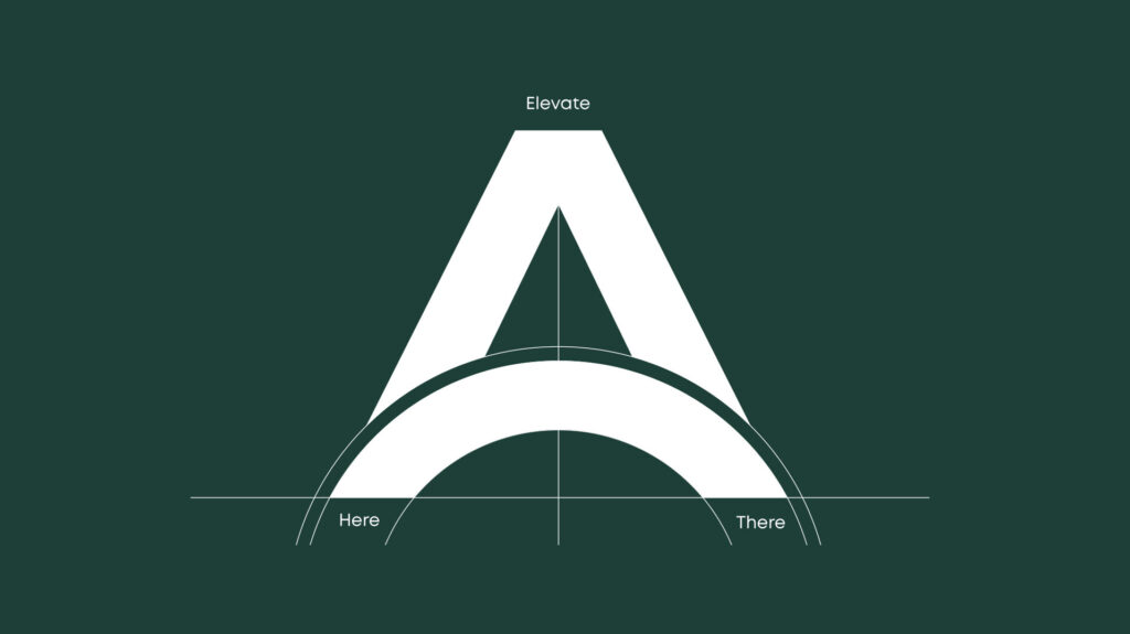
They’re saying: “We’re not just a building. We’re part of your story.” That’s a powerful way to fight the non-space feeling.
London Heathrow
The logo design is simple and refined, not vibrant or eye-catching. But this doesn’t feel like a bad decision because it fits the rest of the brand perfectly. The line that arches through the end of the word “Heathrow” resembles the track of a plane, hinting at the amount of travel that takes place there.

Their approach: don’t be disruptive, be trustworthy. Heathrow doesn’t need a disruptive brand identity – it’s not what the airport’s about. Instead, it secures brand consistency as the entire airport’s branding is refined and conveys trust, security, and professionalism. Heathrow leaves it up to the passengers to bring the excitement.
It’s like that friend who doesn’t need to be the loudest in the room – their steady presence is reassuring enough.
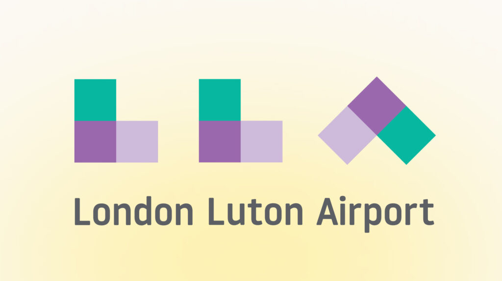
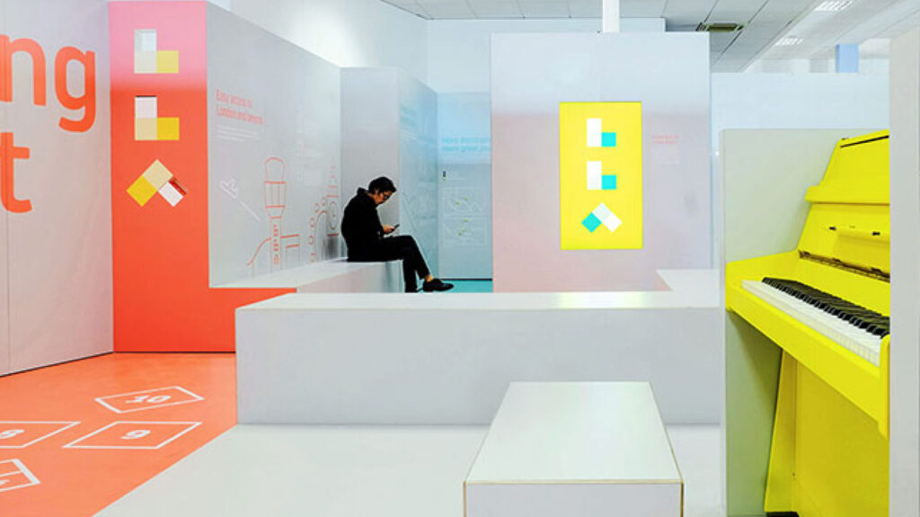
London Luton Airport
ico Design concluded that using common aviation symbols was ineffective as airports are on land. The company thought it best to create something that highlighted the airport and not a vague notion of flight.
Four brand values defined the airport’s difference. These were encapsulated in a succinct brand essence: “Simplicity with a smile” – a determination to deliver easy and enjoyable travel for all passengers, with moments of delight along the way.
The new logo is based on a flexible, modular marque that can be arranged horizontally or vertically and filled with block colors, graphic patterns or photography.
I love this approach because it’s honest. Airports are complex – why pretend otherwise? Better to promise simplicity and actually deliver it.

Dubai International Airport
An audit for Dubai Airports’ brand architecture brought an excessive number of identities to light, which were causing great expense and considerable passenger confusion. As a solution, a “Connecting the World” identity was chosen to represent all the entities – Dubai International, Dubai World Central, Cargo & Logistics and Executive Services.
Their approach: one umbrella for everything. When you have too many identities, it actually means you have no identity at all.
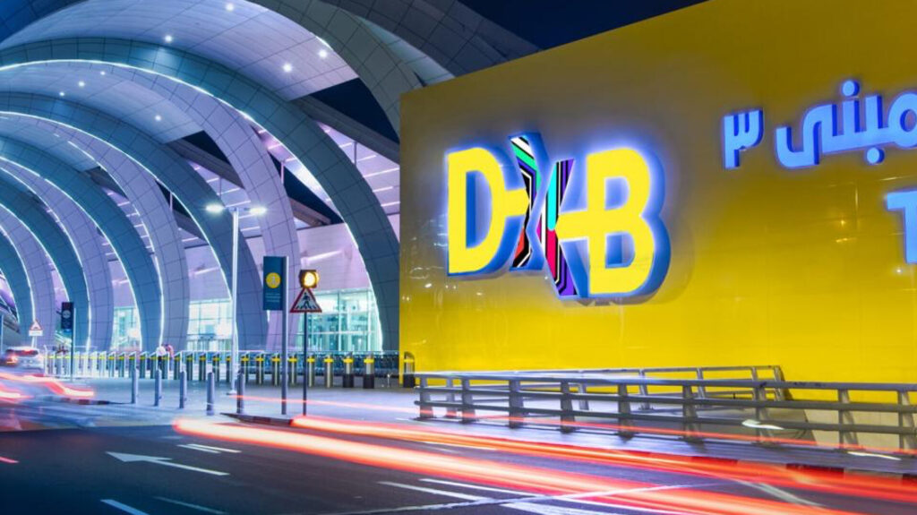
This is such a common problem in large organizations. Sometimes the best design decision is simply: “Stop. Let’s have one clear voice.”
Back to Schiphol: the “Europe’s fourth” problem
Now that we understand the non-space concept and have seen some approaches, let’s return to the Schiphol project and see how they tackled this unique challenge.
Why did they need a new identity?
Schiphol is currently Europe’s fourth busiest airport – after London Heathrow, Istanbul Airport, and Paris Charles de Gaulle. But this wasn’t always the case. The positive passenger experience at Schiphol had been declining for a number of years, and the airport wants to get back into the top three – which isn’t just about rankings, but also about Dutch national pride.
Sander Hengeveld, Schiphol’s head of brand, put it simply: “Schiphol was full of visual noise, and the existing identity simply wasn’t distinctive enough.”
Visual noise in a non-space? That’s like trying to have a conversation at a rock concert. No wonder people were stressed.
The 1967 inspiration
Here’s where it gets really interesting: in 2024, Schiphol decided to return to the spirit of 1967 – the year when the airport was revolutionarily designed by a diverse and multidisciplinary team consisting of architect Marius Duintjer, graphic designer Benno Wassing, and interior designer Kho Liang Ie.
When the team studied their work, a singular lesson emerged – good design can make complex systems feel effortless.
That’s the holy grail, isn’t it? Making complexity look simple. Making chaos feel calm.
The 2024 “dream team”
In the new project, Schiphol’s Executive Team, advertising agency Ace, Eastwood Brand Strategy and Thonik formed a close collaboration. Together, they developed a new brand promise: “Schiphol is a safe haven for world travelers.”
Nikki Gonnissen, Thonik’s co-founder and creative director, explained the process: “To develop a new image for the airport, we started with all the people and parties who help determine how the airport looks and feels today. By sitting down with all the brands, sub-brands, players and stakeholders at and around the airport, we were able to start an iterative and interactive design process that focused on the passenger experience.”
This is smart. They didn’t design in isolation – they talked to everyone. Because an airport isn’t just one thing; it’s an ecosystem.
The “quiet voice” philosophy
Here comes the most brilliant part of the project.
Thomas Widdershoven, Thonik’s co-founder and creative director, articulated the central thought: “If you want to be distinctive, the instinct is to be loud and bold. But airports are already full of loud voices – airlines, shops, advertisements. We felt that if we spoke more quietly, the overall tone might soften, and people would actually hear us more clearly.”
This is a beautiful example of how the less is more principle works in practice. This is the answer to the non-space paradox: you don’t try to be louder than the noise, but instead create calm in the chaos.
When everyone’s shouting, a whisper becomes powerful.
Think about it – in a space that’s fundamentally stressful (security, time pressure, uncertainty), what do people actually need? Not more stimulation. They need peace.
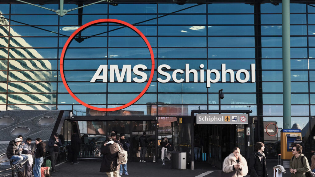
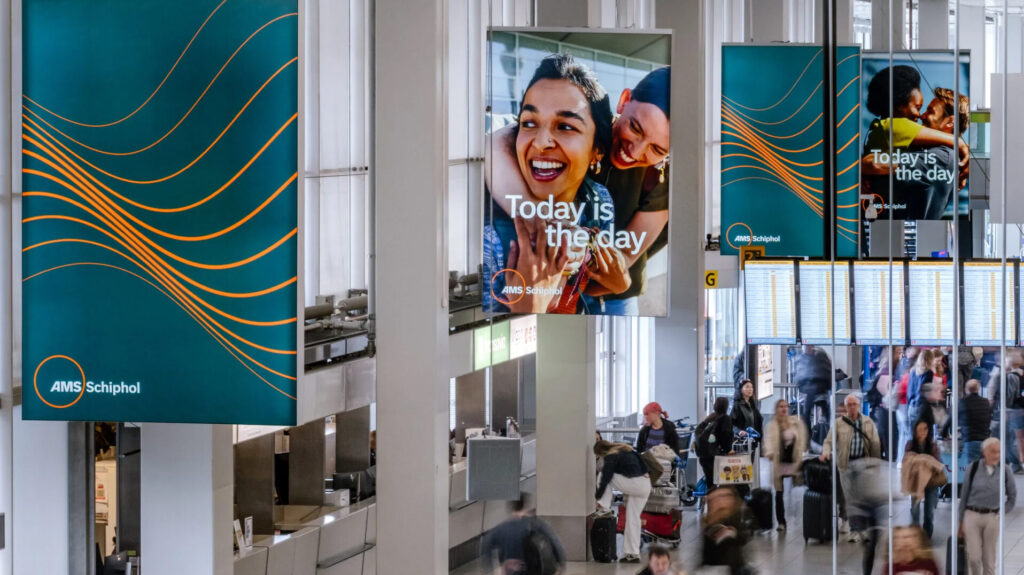
The visual solution: AMS
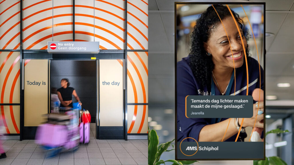
In response to the visual clutter so often synonymous with airports, Thonik crafted a pared-back identity. At its heart sits ‘AMS’ – Schiphol’s IATA code – held within a circle and paired with the Schiphol wordmark.
Nikki Gonnissen explained: “We wanted AMS to feel like the icon – a symbol of place and movement – but Schiphol needed to remain the name people connected with. That balance was crucial.”
The circle that holds ‘AMS’ is deliberately oversized – expansive rather than enclosed – ensuring it doesn’t read as a literal wayfinding dot or tight badge. And here’s a clever detail: a subtle forward slant on the ‘A’ introduces a sense of motion and gives the overall mark a visual rhythm.
The circle from the logo extends into the wider brand world, evolving into ripples or a single guiding line, and at times expanding into a soft pulse of concentric rings.
See how they’re thinking systematically? It’s not just a logo – it’s a visual language that can breathe and adapt.
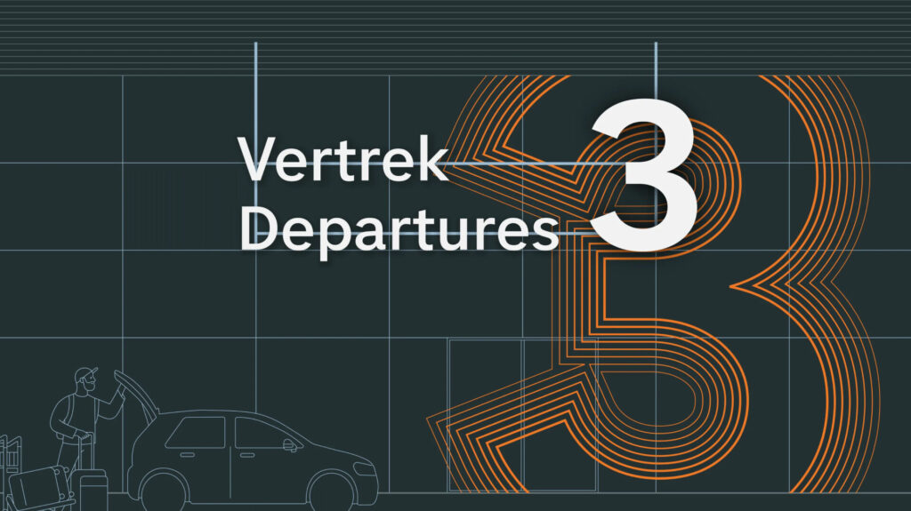
The orange line and Dutch identity
The revamped logo features two central elements: an orange line and a circle with the letters AMS, which refer to Schiphol’s international IATA code and are instantly recognizable to travelers from all over the world.

The orange line forms a connecting element in all communications. And this isn’t random – orange is the Netherlands’ national color, so this subtle reference is simultaneously international and Dutch. This is the answer to the non-space problem: giving local identity to a global space.
It’s saying: “Yes, you’re in transit. But you’re in the Netherlands. You’re somewhere, not nowhere.”
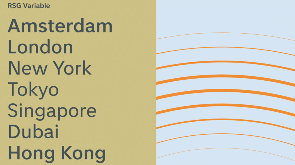
RSG Variable: Schiphol’s own typeface
Here’s another fascinating detail: they developed a font especially for Schiphol – RSG Variable (Royal Schiphol Group Variable) – whose variations can be used for all texts at the airport: commercial and informative, by Schiphol itself and by partner organizations such as Schiphol Parking, Schiphol Media, or Schiphol Real Estate.
This is brilliant because it ensures visual unity across the entire airport – from official signs to partner company communications. One type family that connects everything. This is again an answer to the non-space problem: creating a unified visual language to try to make a “place” from a non-place.
When everything uses the same type, it feels like one coherent environment, not a chaotic collection of different voices.
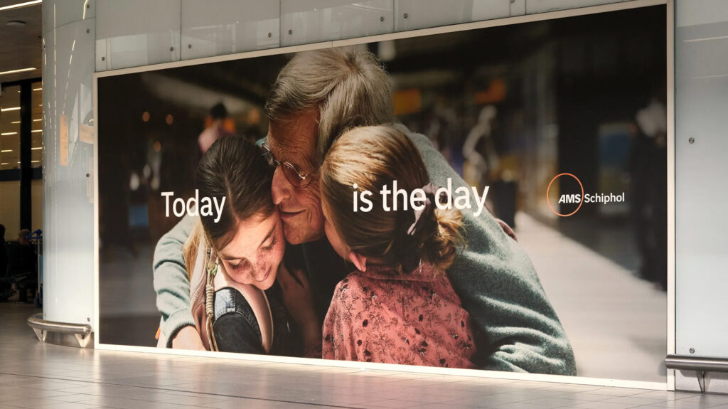
“Today is the day” – the emotional center
The new central brand concept, “Today is the day,” shows that every day at Schiphol revolves around making a difference for travelers. This is all about the feelings that travelers experience at important moments, whether it’s the day of departure, homecoming, or encounter.
“It’s about the excitement of a new adventure, the joy of a reunion or the start of something big. Schiphol wants that day to run smoothly and pleasantly, with clarity and confidence.”
This is creating a human face for the non-space: you’re not just an anonymous passenger; you’re someone having an important day – maybe the most important day of your life.
It reframes the entire experience. Not: “You’re in transit.” But: “Today is your day, and we’re here to make it special.”
The gradual rollout
The new identity is being rolled out over the next two to three years, with Schiphol’s departure halls 1, 2, and 3 reflecting the new branding this autumn. The new brand style has already appeared at Schiphol Plaza, in arrival halls, on the first electric buses, and from October 14th on digital channels.
Notice this: two to three years. Not overnight. Because real change takes time, and you need to bring people along with you.
Why this project matters – and what we can learn from it
This project is a beautiful example that branding isn’t just about being louder, but about being valuable and relevant.
Schiphol’s new identity:
- Returns to roots: the 1960s principles of clarity, simplicity, and passenger-centered design
- Creates calm in chaos: when everyone’s shouting, quiet elegant communication becomes powerful
- Builds unity: one typeface, one visual language across the entire airport
- Creates emotional connection: not just an airport, but a “safe haven” and “home for world travelers”
- Answers the non-space problem: gives local identity (Dutch orange), human stories (“Today is the day”), and visual calm to a fundamentally anonymous, transit space
Arthur Reijnhart, Schiphol’s Chief Commercial Officer, summed it up: “The updated brand identity is the visual representation of our ambition. We are bringing clarity and coherence back to the airport, and a sense of calm back to the travel process. This is an important step towards becoming a high-quality airport.”
What can we learn as designers?
1. You don’t always need to be loud to be heard
Sometimes the most effective communication is the quietest. In our attention-saturated world, restraint can be radical.
Think about this next time you’re tempted to add that extra color, that extra effect, that extra element. What if you removed something instead?
2. Understanding context is critical
Thonik didn’t just design a logo – they understood the non-space problem and responded to it. They did their homework. They understood the challenge.
Before you design anything, ask: “What’s the real problem here? What does this space actually need?”
3. Story is as important as visuals
The AMS logo by itself is just three letters in a circle – but the “Today is the day” narrative gives it meaning. The orange line by itself is just a line – but knowing it represents Dutch identity makes it powerful.
Design without story is just decoration. Story without design can’t be communicated. You need both.
4. Unity > variety
One good type family and a consistent visual language is worth more than a dozen different solutions. Consistency creates recognition. Recognition creates trust. Trust creates connection.
When in doubt, simplify. When things feel scattered, unify.
5. The past can inspire
Returning to the 1967 Schiphol spirit wasn’t nostalgic – it was rediscovering timeless design principles: clarity, simplicity, human-centeredness.
Good design principles don’t age. They just need to be rediscovered by each generation.
6. Give things time
A 2-3 year rollout – because big change can’t happen overnight. Real transformation needs time to take root, for people to adjust, for the system to adapt.
If you’re working on a big project and feeling impatient, remember: Schiphol gave themselves three years. Your project probably deserves time too.
7. Design for the human need, not just the functional requirement
People don’t just need wayfinding – they need reassurance. They don’t just need information – they need calm. They don’t just need efficiency – they need to feel like someone cares about their experience.
Ask: “What does the human being in this space actually need to feel?”
And perhaps the most important lesson: good design helps people navigate – not just physically, but emotionally. Schiphol’s new identity isn’t just about finding your gate; it’s about feeling okay in a place that’s fundamentally designed for you not to belong.
This is what we can learn as designers: you don’t always need to be loud to be heard. Sometimes the most effective communication is the quietest. And sometimes the best thing you can do in a chaotic space is to bring a little bit of peace.
Because at the end of the day, that’s what design is about: making people’s lives a little bit better, one thoughtful decision at a time. 🎯
Sources:
- Marc Augé: Non-Places: Introduction to an Anthropology of Supermodernity (1995)
- Thonik – Schiphol Airport project page
- Design Week: Thonik’s new identity for Schiphol Airport
- Thonik: Collaborating for a better passenger experience
- Schiphol official press release