

The Signature That Became an Icon: J&J’s 135-Year Visual Journey
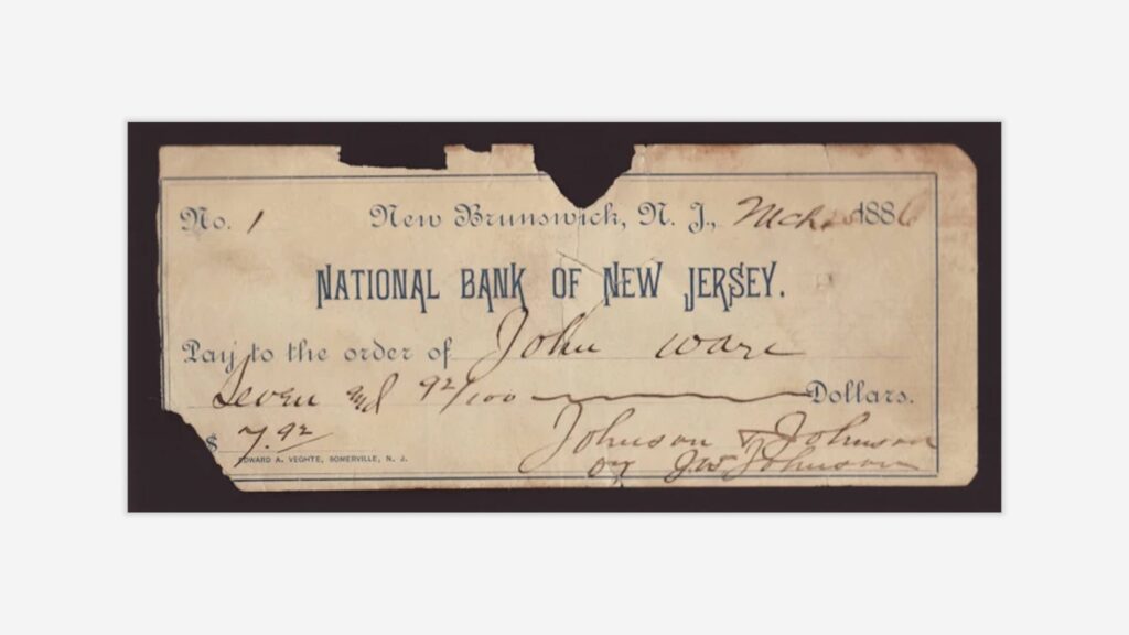
The story of Johnson & Johnson’s visual identity begins with a signature—literally! Back in 1886, co-founder James Wood Johnson signed the company’s first check, and that handwritten flourish became the iconic logo that would represent the company for more than 130 years. Can you imagine any digital brand today using its founder’s handwriting as the cornerstone of their visual identity? It’s a charming reminder of a different era when companies were deeply connected to their founders’ identities.
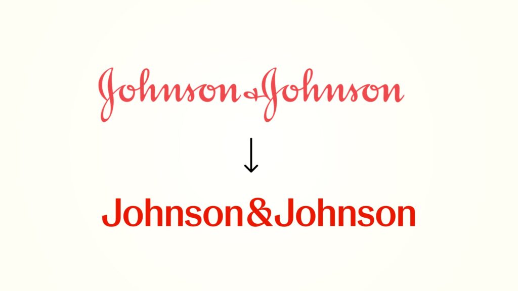
This flowing script served as one of the longest-used corporate emblems in the world, a visual thread connecting generations of consumers to the brand. But in September 2023, the company decided it was time for a change, unveiling a completely transformed visual identity that replaced the signature script with a modern sans serif wordmark—signaling a new chapter focused exclusively on healthcare innovation.
From Baby Shampoo to Biotech: Visual Identity Supporting a Business Transformation
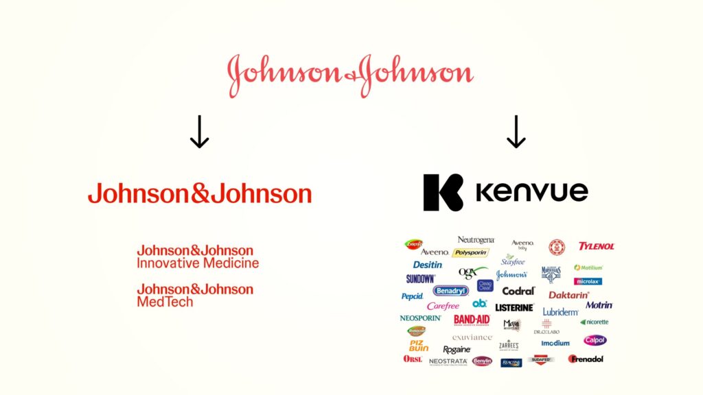
The new visual identity wasn’t just about modernizing an aging logo—it reflected a strategic pivot in Johnson & Johnson’s business. The company had strategically repositioned itself as a pure healthcare company, divesting its consumer health division (now operating as Kenvue) to focus exclusively on pharmaceuticals and medical technology.
Think of it as Johnson & Johnson decluttering its corporate house, selling off the consumer products we’re all familiar with (those baby shampoo bottles that don’t make you cry!) to focus on the more complex, specialized work of developing medicines and medical devices. The new visual identity beautifully reflects this strategic shift, unifying its pharmaceutical segment (formerly Janssen, now Johnson & Johnson Innovative Medicine) and medical technology segment (Johnson & Johnson MedTech) under a cohesive brand architecture.
This visual consolidation emphasizes the company’s ability to “innovate across the full spectrum of healthcare in ways no other company can”—a powerful statement about their unique position in the marketplace.
When Tradition Meets Digital Demands: J&J’s Rebrand as a Design Masterclass
For designers like us, J&J’s rebranding represents a fascinating case study in balancing heritage with modernization. The decision to abandon a 135-year-old iconic mark demonstrates how even the most established brands must eventually evolve to meet digital demands while maintaining their brand essence.
This transformation offers several valuable lessons:
- Even the most iconic visual identities may require evolution to stay relevant
- Digital functionality sometimes needs to win over tradition (especially when younger generations struggle to read cursive!)
- Strategic pivots often necessitate visual transformation
- Heritage elements (like color) can provide continuity during dramatic change
💡
The rebrand illustrates the ongoing trend of simplification in corporate identity, particularly among heritage brands adapting to digital-first environments.
As a designer, watching major brands like J&J navigate these waters can inform how we approach similar challenges with our own clients.
Visual Identity Breakdown
Logo & Iconography
Design analysis and symbolism
The original Johnson & Johnson logo featured James Wood Johnson’s signature in a flowing, cursive script that conveyed a personal touch and trustworthiness—almost like a handwritten promise from the founder himself. It had that wonderful human quality that many modern logos lack, a reminder that behind this massive corporation was a real person who signed his name to the company’s work.
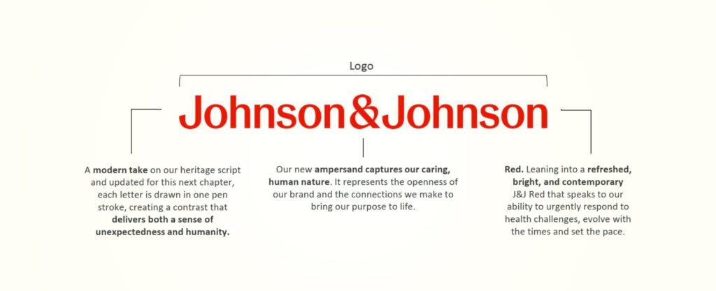
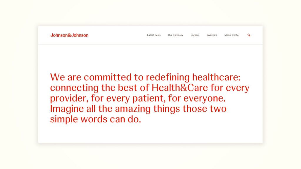
The new logo, in contrast, employs a modern sans serif typeface with each letter “drawn in one pen stroke, creating a contrast that delivers both a sense of unexpectedness and humanity.” While it’s definitely more contemporary, the designers were clever in preserving some of that human touch through the single-stroke drawing technique.

The ampersand has been particularly emphasized in the new design, and it’s not just a typographic choice—it represents “the openness of the brand, as well as the connections that bring the Company’s purpose to life.” I love when symbols carry deeper meaning like this! The ampersand becomes a visual metaphor for connection and collaboration in healthcare.
Evolution over time
The visual evolution of Johnson & Johnson spans three distinct eras:
- 1886–1887: James Wood Johnson’s signature appears on the first company check, establishing the visual foundation. Imagine being in that moment, not knowing that casual signature would represent the company for over a century!
- 1887–2023: The signature becomes formalized as the company logo, remaining remarkably consistent for over 130 years. Through world wars, the Great Depression, the digital revolution, and countless cultural shifts, that flowing script endured.
- 2023–present: Complete redesign introducing a modern sans serif wordmark with a distinctive ampersand that abandons the script heritage while maintaining the red color palette. A bold leap into the company’s next chapter!

Versatility and application across mediums
The new identity system includes both long-form “Johnson & Johnson” and short-form “J&J” versions, with particular emphasis on building “more equity around a short-form ‘J&J’ to show up in a more personable, contemporary way—especially in digital interfaces.”
This is really smart design thinking! The brand is designed to “show up in motion and respond to different environments,” reflecting the need for greater versatility across today’s expanded media landscape. In our mobile-first world, having a compact version of your brand mark that still carries the same weight and recognition is incredibly valuable.
Color Palette
Psychological impact of chosen colors
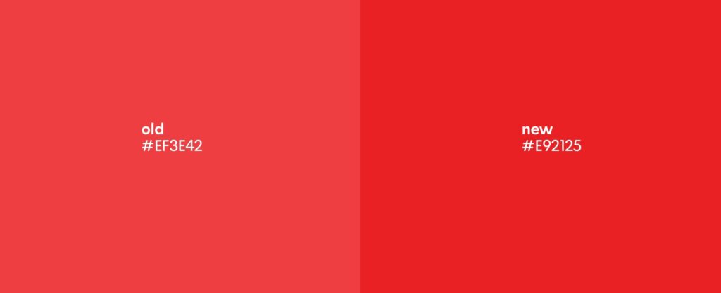
Johnson & Johnson has consistently employed red as its signature color, which communicates urgency, leadership, and the “ability to respond fast to any healthcare situation.” Red is a powerful choice in the healthcare space—it conveys energy and confidence while creating that immediate brand recognition.
Think about it: when you see that particular shade of red, even without the name, there’s a good chance J&J comes to mind. That’s the power of color consistency in branding!
Color harmony and contrast
The 2023 rebrand introduced a “refreshed, bright, and contemporary” red that speaks to the company’s “ability to urgently respond to health challenges, evolve with the times and set the pace.” This vibrant update maintains brand recognition while signaling innovation and modernity.
It’s like when you repaint your living room walls—same color family, but a fresher, more contemporary shade that makes everything feel updated without losing the room’s identity. The refreshed red creates that same effect for the brand.
Consistency across brand touchpoints
The red color serves as a unifying element across the brand’s various touchpoints, creating visual cohesion as the company transitions to its new identity system. The refreshed red appears consistently across digital and print applications, reinforcing brand recognition during the transition period.
This consistency is crucial during a rebrand of this scale—when so much is changing, having one strong visual anchor helps audiences maintain their connection to the brand.
Typography
Font choices and their implications
The original script resembled calligraphic fonts like “Gelato Fresco Extra Bold, Adelica Brush Regular, Ollie, and the Lelet script,” reflecting the era of handwritten signatures when the company was founded. It had that wonderful vintage quality that evoked trust and tradition.
The new typography employs a contemporary sans serif that prioritizes clarity and legibility, especially in digital contexts, while maintaining a human touch through the single-stroke drawing technique. It’s a perfect example of finding that balance between modern functionality and maintaining character.
Hierarchy and readability
The shift from script to sans serif addresses significant readability challenges in the digital era. Marketing consultant Laura Ries noted that “many children no longer learn to write cursive in school,” making the original logo increasingly difficult for younger generations to process.
This is such an interesting real-world challenge that many heritage brands face! Your logo might be iconic, but if an entire generation struggles to read it quickly, you’re creating an unnecessary barrier between your brand and potential customers.
💡
The new typeface is “easier to process” and “almost even draws your attention to it” through its improved legibility. In our information-saturated world, that instant recognition is invaluable.
Custom vs. standard typefaces
Both the original script and new typography represent custom designs. The original was derived directly from James Johnson’s handwriting, while the new typeface appears to be custom-designed specifically for Johnson & Johnson.
Custom typography is a significant investment, but for a global brand of this scale, it’s absolutely worth creating a proprietary typeface that perfectly embodies the brand’s character and can’t be mistaken for any other company.
Layout & Composition
Grid systems and visual structure
The new visual identity employs a structured yet flexible approach that balances consistency with adaptability across applications. The brand elements are designed to work harmoniously within diverse layouts while maintaining clear brand recognition.
Think of it as creating a visual “toolkit” rather than rigid templates—designers have room to create while still maintaining the core brand identity.
White space utilization
The modernized visual system embraces more generous white space, creating breathing room around the logo and other brand elements that enhances visibility and impact, particularly in digital environments.
I’m a huge fan of this approach! White space isn’t empty space—it’s an active design element that gives your brand room to breathe and stand out. The strategic use of white space signals confidence and clarity, perfect for a company focused on healthcare innovation.
Responsive design considerations
Johnson & Johnson’s new visual identity was clearly developed with digital-first considerations, designed specifically to function effectively across various screen sizes and interface types. The shorter “J&J” version provides additional flexibility for smaller screens and social media applications.
In today’s multi-device world, this kind of responsive thinking isn’t just nice to have—it’s essential. Your brand needs to look equally strong on a billboard, a desktop screen, and a tiny mobile icon.
Design System
Graphic Elements: Icons, patterns, and illustrations
The ampersand emerges as a central graphic element in the new design system, representing the connections between Johnson & Johnson’s various healthcare initiatives. The ampersand’s design has been specifically crafted to capture “a caring, human nature” that embodies the brand’s personality.
I love when a single element like this can carry so much meaning! The ampersand becomes more than just a conjunction—it’s a symbol of the brand’s ethos of connection and collaboration.
Visual Hierarchy: How information is prioritized visually
The new visual identity system establishes a clear hierarchy with the Johnson & Johnson name (or J&J abbreviation) taking prominence, reinforced by the distinctive ampersand and vibrant red color. This hierarchy ensures consistent brand recognition across diverse applications.
Good visual hierarchy is like good conversation—it guides you naturally through information in order of importance, without you even noticing it’s happening.
Consistency vs. Flexibility: Adaptability of the design system
The rebranded visual system balances consistency with flexibility, maintaining core elements (logo, color, ampersand) while allowing for adaptability across different mediums and applications. This approach enables the brand to remain recognizable while responding to different contextual needs.
It’s the “bend but don’t break” philosophy of modern branding—rigid enough to maintain identity, flexible enough to work everywhere.
Brand Imagery
Photography Style: Mood, composition, and subject matter
The new Johnson & Johnson art direction employs imagery “crafted to spark energy, optimism and inclusivity, all while offering a unique and distinctive approach in healthcare.” This suggests a warmer, more human-centered approach to healthcare imagery that distinguishes the brand from clinical, sterile healthcare visuals.

Healthcare imagery often falls into two traps: either too clinical and cold, or too saccharine and artificial. Finding that authentic middle ground—showing real human moments in healthcare contexts—can be incredibly powerful.
Illustration Approach: Style, technique, and integration with other elements
While specific illustration details aren’t thoroughly documented in the available information, the art direction appears to include illustration as part of a broader visual language designed to communicate care and humanity alongside scientific expertise.
💡
Illustration can add warmth and approachability to healthcare communication, helping to simplify complex topics and add emotional resonance to scientific information.
Video & Animation: Motion graphics and kinetic typography
Motion is explicitly mentioned as an element of the new brand identity, with the brand designed to “show up in motion and respond to different environments.” This suggests an integrated approach to animation that brings the static elements to life in dynamic contexts.
Static logos that transform into motion graphics create memorable moments for audiences—think about how the Nike swoosh or the Google dots have been animated to create distinctive brand moments.
Digital Presence
Website Design: User interface and experience analysis
The new visual identity was developed with particular attention to digital applications, suggesting a user interface that balances clarity with brand personality. The simplified logo and typography enhance readability and recognition on screens of all sizes.
💡
A website is often the primary touchpoint for many audiences today, so ensuring your visual identity works beautifully in this context is absolutely critical.
Mobile App Visuals: Adaptation of brand elements for small screens
The creation of a short-form “J&J” version demonstrates specific consideration for small-screen applications, allowing for stronger brand presence in constrained digital environments like mobile apps and social media icons.
When your logo needs to fit in a tiny app icon or social media avatar, having a compact version that maintains recognition is invaluable.

Social Media Strategy: Visual consistency and platform-specific adaptations
Johnson & Johnson’s rebranding reflects an understanding that social media requires both consistency and flexibility. The simplified logo and emphasized ampersand create distinctive visual assets that can be adapted across various social platforms while maintaining brand recognition.
Different social platforms have different visual languages and technical requirements—a smart brand system addresses these variations while maintaining a consistent identity.
Print & Physical Media
Packaging Design: Product packaging aesthetics and functionality
The consumer products division, now operating as Kenvue, will continue using the original Johnson & Johnson logo temporarily. Eventually, all Johnson & Johnson branding will transition to the new visual identity, while consumer products under Kenvue will develop their own distinct visual identity.
This transition period presents interesting challenges—how do you manage a brand split without confusing consumers who associate specific products with your legacy branding?
Marketing Collateral: Brochures, business cards, and other print materials
The new visual identity system appears designed to create a cohesive look across all marketing materials, unifying the company’s communications under a single, recognizable brand aesthetic that emphasizes healthcare innovation.
Even in our digital age, physical touchpoints matter enormously for healthcare brands—from conference materials to physician education pieces.

Environmental Graphics: Signage and spatial branding
While specific environmental applications aren’t detailed in the available information, the simplified logo and bold color choices suggest effective adaptability to signage and physical spaces.
Environmental branding for healthcare companies extends from hospital signage to research facilities and corporate offices—each space an opportunity to reinforce brand identity.
Visual Brand Consistency
Cross-Platform Coherence: How well the visual identity translates across mediums
The rebranding strategically addresses cross-platform application challenges by simplifying the logo, emphasizing a distinctive ampersand, and maintaining the recognizable red color scheme—all elements that translate effectively across diverse media platforms.
💡
Think of your visual identity as needing to pass the “squint test”—even when significantly reduced or viewed from a distance, does it maintain its essential character?
Brand Style Guide: Key elements and guidelines
The Johnson & Johnson brand identity includes specific guidelines for logo usage (including short-form “J&J”), color application (the refreshed, contemporary red), typography, and the distinctive ampersand—all designed to ensure consistent application across touchpoints.
A robust style guide is the unsung hero of successful rebrands—it ensures that everyone from internal teams to external partners understands how to properly implement the new visual system.
Visual Brand Voice: How visuals reinforce brand personality
The new visual identity is described as “differentiated, vibrant, dynamic and bold,” reinforcing Johnson & Johnson’s strategic positioning as an innovative healthcare company. The visual elements communicate both scientific authority and human care, reflecting the company’s dual focus on innovation and patient outcomes.
Visual brand voice is as important as verbal brand voice—they should work in harmony to tell a consistent story about who you are.
Innovation & Trends
Design Risks: Bold choices and their outcomes
Abandoning a 135-year-old signature logo represents a significant risk that has “generated much debate on social media.” However, this bold move aligns with the company’s strategic repositioning and addresses practical challenges with the original logo’s legibility in digital contexts.
Sometimes the riskiest choice is making no change at all—especially when your industry and audience are evolving around you.
Technology Integration: Use of AR, VR, or other emerging tech in visual branding
While specific technology integration isn’t detailed in the available information, the design’s emphasis on motion and digital adaptability suggests readiness for emerging technological applications.
Forward-thinking brands don’t just design for today’s technology—they create visual systems that can evolve into tomorrow’s platforms.
Industry Influence: How the brand’s visuals impact design trends
Johnson & Johnson follows a broader trend among established brands toward simplified visual identities optimized for digital interfaces. As one of the oldest and most recognized healthcare brands, its modernization may influence other healthcare companies to similarly update their visual identities.
When a brand with this much heritage makes a significant change, it often gives permission to others in the industry to follow suit.
Impact & Communication
Audience Perception: How visuals influence brand trust and loyalty
The rebranding aims to maintain trust while signaling innovation. As marketing consultant Laura Ries noted, the new logo is “easier to process” and potentially draws more attention through its improved legibility, potentially strengthening brand recognition among younger audiences unfamiliar with cursive writing.
Trust is the most precious commodity for healthcare brands—visual changes must enhance, or at least maintain, this foundation of trust.
Market Performance: Link between visual strategy and business outcomes
The rebranding directly supports Johnson & Johnson’s business strategy to focus exclusively on healthcare innovation through its pharmaceutical and medical technology segments. The unified visual approach reinforces the company’s ability to “innovate across the full spectrum of healthcare.”
💡
Effective rebranding doesn’t just look good—it strategically supports business objectives and helps drive performance.
Brand Storytelling: Visual narrative and emotional connection
The new brand identity aims to “demonstrate the best of Johnson & Johnson’s care and humanity, while capturing the Company’s passion and determination to improve the health of people worldwide,” maintaining an emotional connection while signaling a forward-looking approach.
Visual storytelling creates emotional connections that facts and figures alone cannot achieve—particularly important in healthcare, where both scientific credibility and human empathy matter.
Designer Insights
Reimagining a 135-Year Icon: The Technical Mountain Behind J&J’s Rebrand
Replacing one of the world’s longest-used corporate logos presented significant technical challenges, particularly in balancing heritage with modernization while ensuring effective performance across all media platforms.
I can only imagine the rounds of testing and refinement required to ensure the new identity worked seamlessly across all applications!
Elite Agency Partnership: Wolff Olins’ Strategic Approach to J&J’s Transformation
While specific design tools aren’t mentioned in the available information, the rebrand was created by Wolff Olins, a renowned brand agency known for its strategic approach to corporate identity.
Working with top-tier agencies brings not just design expertise but strategic thinking that connects visual identity to business objectives.
Business Meets Design: The Crucial Leadership-Creative Partnership Behind the Scenes
The comprehensive nature of the rebrand suggests close collaboration between Johnson & Johnson’s leadership and the Wolff Olins design team to ensure alignment between business strategy and visual expression.
The most successful rebrands happen when designers and business strategists work hand-in-hand throughout the process.
Future Outlook
Predicted Evolution: Potential future directions for the brand’s visual identity
As Johnson & Johnson continues its focus on healthcare innovation, we may see further evolution of the visual system to incorporate emerging technologies and communication channels while maintaining the core elements established in the 2023 rebrand.
The best brand systems are designed to evolve over time while maintaining their essential character.
Upcoming Challenges: Visual hurdles the brand may face
Johnson & Johnson will need to navigate the transition period as consumer products (now under Kenvue) gradually phase out the original logo, potentially creating temporary brand confusion that will require careful management.
💡
SBrand transitions of this scale are like changing planes mid-flight—they require careful planning and flawless execution.
Industry Implications: How this brand might influence future design trends
As a major healthcare company embracing simplified, digital-friendly branding, Johnson & Johnson may accelerate similar transformations among other healthcare organizations still using complex or outdated visual identities.
When industry leaders make bold moves, they often create a ripple effect throughout their sector.
Key Takeaways & Action Items
💡
Timeless Design Wisdom: Four Essential Lessons from J&J’s Bold Transformation
- Even the most established brand marks may require evolution to meet digital demands
- Strategic repositioning often necessitates visual transformation
- Successful rebrands balance heritage elements (like color) with modern updates
- Practical considerations (like legibility) can justify departures from tradition
These lessons apply whether you’re working with global corporations or local businesses—the principles of effective visual identity remain consistent across scales.
Improvement Opportunities: Constructive critique of the brand’s visual strategy
The abrupt transition from a 135-year-old signature to a modern sans serif represents a dramatic shift that could have potentially benefited from a more gradual evolution to help audiences adjust while maintaining greater connection to the brand’s heritage.
Even the best rebrands have opportunities for improvement—analyzing these can help us learn for our own projects.
Put It Into Practice: Four Ready-to-Use Design Strategies for Your Next Rebrand
- Consider how your brand marks perform across digital interfaces
- Evaluate whether script typography creates readability barriers for younger audiences
- Identify core brand elements that should remain consistent through any redesign
- Ensure visual systems support strategic business positioning
These practical takeaways can inform how we approach our own branding projects, regardless of scale or industry.
Honoring the Past While Embracing the Future: Lessons from J&J’s Visual Evolution
Johnson & Johnson’s transformation from a signature-based script to a modern sans serif represents one of the most significant corporate rebrands in recent history. By maintaining its distinctive red color while modernizing its typography and emphasizing the ampersand, the company has created a visual system that supports its strategic focus on healthcare innovation while improving functionality across digital platforms.
The Johnson & Johnson rebrand demonstrates that even the most established visual identities must evolve to remain relevant. By balancing heritage with innovation, the company has created a visual system that honors its 135-year history while positioning it for future growth in the rapidly evolving healthcare sector.
How do you feel about Johnson & Johnson’s decision to abandon its iconic script logo? Do you think heritage brands should prioritize tradition or digital functionality when considering rebrands? Share your thoughts on the balance between honoring brand history and embracing modern design needs!
