


Quick Overview On How To Choose Fonts For Branding
| Step | How to Do It |
|---|---|
| Step 1: Define Your Brand Identity | Reflect on your mission, values, and personality to choose typefaces that align with your company’s core identity and style. |
| Step 2: Evaluate Your Audience and Market | Research demographics and market trends to select fonts that resonate with your target audience and stand out among companies. |
| Step 3: Understand Font Classifications and Styles | Learn the differences between Serif fonts, Sans-serif fonts, Display fonts, script fonts, and decorative fonts to choose the right style for your design. |
| Step 4: Analyze Competitors and Current Trends | Investigate how leading brands use modern fonts and classic typefaces to inspire your choice while ensuring your identity remains unique. |
| Step 5: Consider Functionality and Legibility | Test your chosen fonts across various media to ensure excellent readability and clarity in both digital and print formats. |
| Step 6: Prioritize Versatility and Consistency | Create a comprehensive style guide that details which fonts and design elements to use consistently across all marketing channels. |
| Step 7: Test Font Pairings and Combinations | Experiment with pairing a bold typeface for headlines with crisp Sans-serif fonts for body text to establish a clear visual hierarchy. |
| Step 8: Customize and Personalize Your Chosen Fonts | Adjust spacing, weight, or incorporate a handwritten style to develop a custom brand identity that stands apart from off-the-shelf options. |
| Step 9: Consider Licensing and Practical Concerns | Weigh free versus premium fonts; ensure proper licensing so your fonts can be used confidently across all business platforms. |
| Step 10: Seek Feedback and Refine Your Choices | Gather insights from stakeholders and target audience members, then iteratively refine your font choices using a detailed style guide for consistency. |
| Step 11: Finalizing and Implementing Your Font Choice | Develop guidelines for the integration of your fonts into all brand materials, ensuring that the identity remains consistent and engaging across channels. |
The Power of Typography in Branding
Typography is much more than just text on a page—it’s a critical design element that plays a huge role in shaping a company’s identity. The right fonts do more than deliver words; they establish a strong brand identity by blending style with substance. Whether you lean toward classic fonts or contemporary typefaces, the interplay of lines and color in your chosen fonts can set the tone for your entire marketing strategy. It’s this mix of art and functionality—emphasizing readability alongside creative typefaces—that makes selecting fonts for branding both an exciting and essential task.
Step #1: Define Your Brand Identity
Understanding Your Brand’s Persona
The journey begins with an honest reflection on who you are. Ask yourself: What is your brand’s core identity? What values and messages do you want to convey through every design element? For instance, a startup aiming for a modern, crisp sans-serif style might pursue a bold brand identity, while a traditional company might favor the classic appeal of Serif fonts. This foundational step helps ensure that your font selection aligns with your company’s values and core brand color palette.
Translating Personality into Type
Your font choice should mirror the spirit of your brand—not just a set of letters, but a creative typeface that embodies your identity. In branding, aligning your fonts with your target audience’s expectations is key, whether you’re showcasing a handwritten style or a stylized modern option.
Step #2: Evaluate Your Audience and Market
The next step in this creative journey is understanding who you’re talking to. Different audiences resonate with different styles. Whether you’re addressing tech companies, brands to tech companies, or a diverse target audience, considering the demographics and preferences of your audiences is essential. Think about whether your design resonates with a youthful, dynamic crowd or a more mature, established market.
Examine what companies in your niche are doing. A glance at prominent companies—like the American Broadcasting Company, for instance—can reveal trends such as the use of modern fonts or crisp sans-serif styles. This comparison not only offers insights into current practices but also informs how you can differentiate your brand with a unique range of styles and a thoughtful style guide.
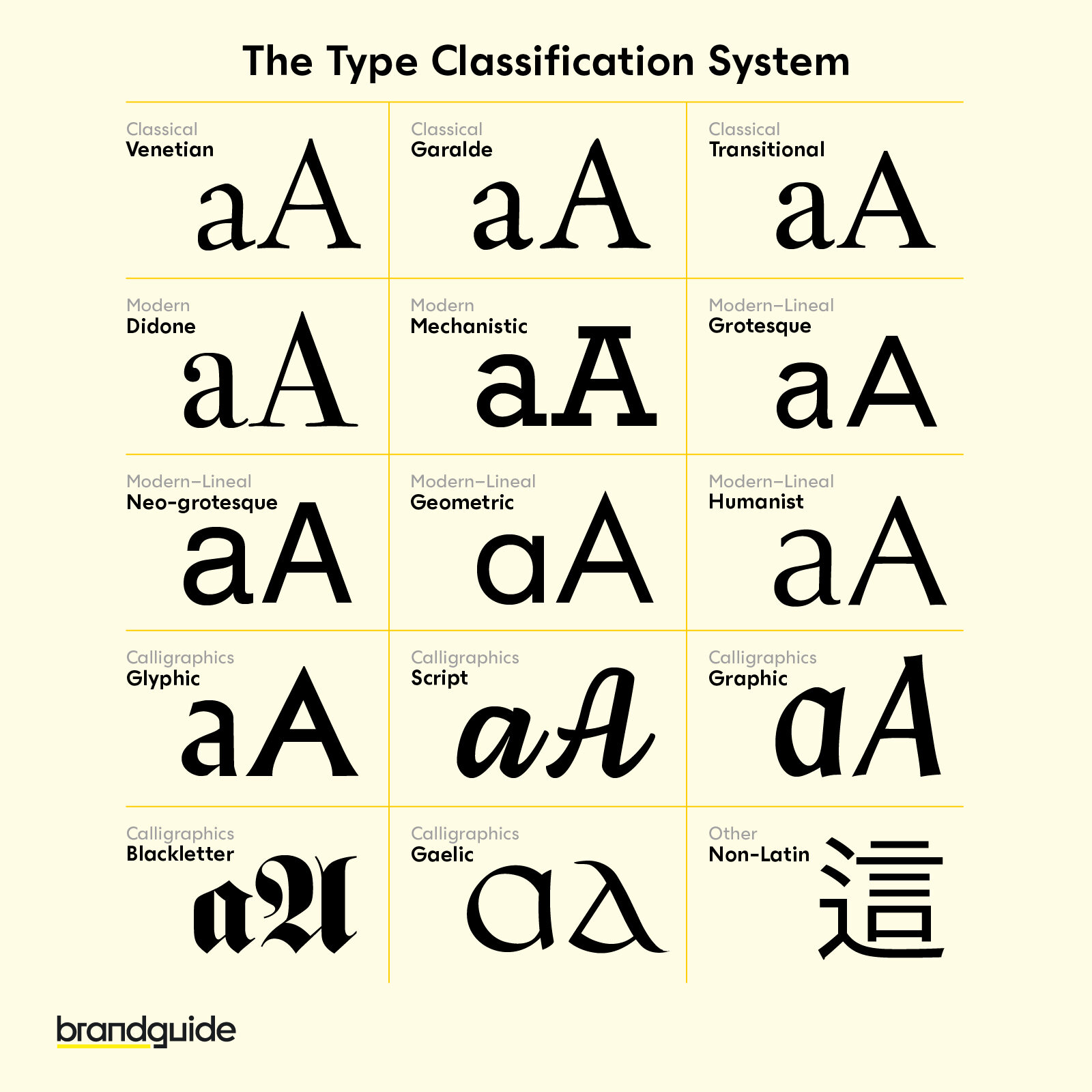
Step #3: Understand Font Classifications and Styles
Before you make your decision, it’s vital to understand the diverse classifications available. Here’s a quick rundown:
- Serif fonts: Traditional, with small decorative lines, exuding reliability and classic typefaces ideal for conveying a strong, traditional identity.
- Sans-serif fonts: Clean and modern, these fonts are well-suited for digital interfaces and contemporary brands, offering a crisp sans-serif style that enhances readability.
- Display fonts and script fonts: These include creative typefaces such as decorative fonts and handwritten fonts that provide a unique visual impact, best used sparingly to maintain legibility.
Each category has its own style and personality, whether you need a bold typeface for hierarchy in your marketing or a creative typeface to capture attention.
Step #4: Analyze Competitors and Current Trends
Taking cues from top companies and industry leaders can provide valuable insights. Brands like Adobe are known for their cutting-edge design and often incorporate a mix of Serif fonts, modern fonts, and even stylized fonts to maintain a distinct identity. Analyze the typography of other companies to see which typefaces and color combinations are making an impact. Remember, while trends can serve as inspiration, your goal is to develop a custom brand identity that reflects your unique values and core brand color.

Step #5: Consider Functionality and Legibility
A beautiful font is only truly effective if it works seamlessly across all applications. Excellent readability is paramount, whether you’re using your font on websites, business cards, or marketing brochures. Test the chosen font’s legibility by checking how the lines and curves hold up at various sizes and on different backgrounds—particularly paying attention to the correct typeface in both digital and print forms.
Step #6: Prioritize Versatility and Consistency
Consistency across all design elements—from the chosen fonts to the complementary color scheme—builds a strong identity. Develop a detailed style guide that specifies the right fonts and a range of styles that work harmoniously with your color palette. This guide serves as a roadmap ensuring that every piece, from bold typeface headers to subtle, complementary style combinations, reinforces your brand identity across every channel.
Step #7: Test Font Pairings and Combinations
Fonts rarely work in isolation; often, the magic happens when you pair different types of fonts to create a clear visual hierarchy. For example, consider pairing a bold typeface for headings with a crisp sans-serif style for body text. Experiment with various pairings—mixing classic fonts with modern fonts, or even integrating decorative fonts with understated, correct typefaces—to discover which combinations best express your design vision.
Step #8: Customize and Personalize Your Chosen Fonts – Making It Uniquely Yours
Once you narrow down your options, explore the possibility of customization. Tweak spacing, weight, or even add a touch of a handwritten style to create custom fonts that are exclusive to your brand. By personalizing your fonts, you can develop custom brand identities that stand out in marketing materials and resonate deeply with your target audience. This approach can set you apart from companies that rely solely on off-the-shelf typefaces.
Step #9: Consider Licensing and Practical Concerns – Free Versus Premium Options
Budget considerations aside, licensing is an important factor when selecting fonts. Free fonts for business logos might be enticing but often come with limitations, especially when it comes to using a consistent range of styles across all channels. Licensed fonts, however, offer long-term security and the appropriate usage rights for companies scaling their marketing efforts. This step ensures that your investment aligns with your core values and broader design strategy.
Step #10: Seek Feedback and Refine Your Choices
Sometimes, the best insights come from an honest conversation with your target audience. Gather opinions from stakeholders and trusted designers, and use a dedicated style guide to document any refinements. This iterative process can make a significant difference—what initially appears as a bold brand identity might need small tweaks to achieve optimal readability and appeal.
Step 11: Finalizing and Implementing Your Font Choice
After thorough testing, it’s time to integrate your chosen fonts into every facet of your brand. Develop a comprehensive style guide that outlines every aspect— from which modern fonts to use for headers to the complementary style for body text. Consistency in employing these design elements across digital and print media not only bolsters your brand identity but also reassures your audience that every detail has been carefully considered.
Bonus: Additional Tips and Emerging Trends
Keeping your brand fresh means staying ahead of the curve by embracing emerging trends and experimenting with your typography. In addition to our earlier tips, consider this expanded advice to infuse new energy into your design strategy. Innovation in typography and design can set you apart in a competitive market. As brands continually evolve, here are several additional considerations:
- Variable Fonts: Explore fonts that adjust to different weights and widths, ensuring optimal readability across diverse media.
- Mixing Design Elements: Pair creative typefaces with complementary styles to craft a unique hierarchy.
- Seasonal Tweaks: Refresh your core color palette and stylistic elements to resonate with current trends.
- Crisp Sans-serif Styles: Prioritize modern fonts that maintain crisp clarity in digital interfaces.
- Custom Typography: Consider designing custom fonts that reflect your brand’s distinct personality.
Conclusion
Choosing the right font for your brand is as much an art as it is a science. It requires a deep understanding of your identity, an appreciation for diverse typefaces, and a commitment to creating design elements that echo your core values. Whether you’re leaning towards contemporary typefaces or classic fonts, remember that every style—from Display fonts to script fonts—offers its own narrative for your brand. Embrace the process, experiment with a range of styles, and let your brand speak through a thoughtfully curated style guide.
Your font isn’t just a design element—it’s the silent ambassador of your brand. So go ahead, refine your choices, and make a mark that truly resonates with your target audience.