

Quick Takeaways
| Step | How to Do It |
|---|---|
| Define Your Brand Personality and Energy | Identify the emotions and energy (e.g., passion, calm, creativity) you want your brand to evoke, and choose a primary color that embodies these traits. |
| Understand Your Target Audience | Research cultural influences, demographics, and customer preferences to ensure your chosen colors resonate with potential customers. |
| Select Your Dominant Color | Choose one primary color that represents your brand’s identity and serves as the foundation of your palette. |
| Build Your Palette | Add 3–4 accent colors and neutral tones (white, gray, or black) to create a balanced, harmonious color scheme. |
| Ensure Consistency Across Platforms | Apply your color palette uniformly across all branding materials, including digital, print, and physical spaces, to reinforce recognition and trust. |
| Test and Iterate | Use A/B testing, surveys, and user feedback to fine-tune your color choices and measure their impact on engagement and conversions. |
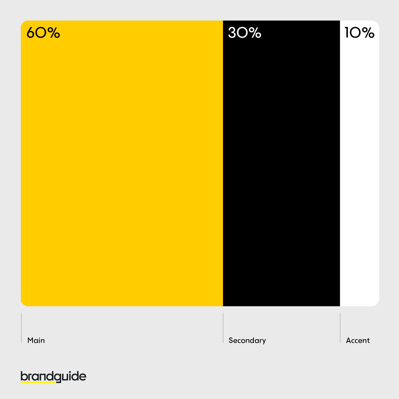
| Apply the 60/30/10 Color Rule | Use 60% of your design for the dominant color, 30% for the secondary color, and 10% for accent elements to achieve a balanced and visually appealing design. |
Understanding Color Psychology
Color psychology is the study of how colors affect human behavior, perceptions, and emotions. It goes beyond mere visual appeal—different hues and tones can spark emotional responses, influence energy levels, and even affect how customers perceive a business. For example, a bold, passionate red might evoke energy and urgency, while a cool, calming blue instills trust and balance.

The Science Behind Color Perception and Color Theory
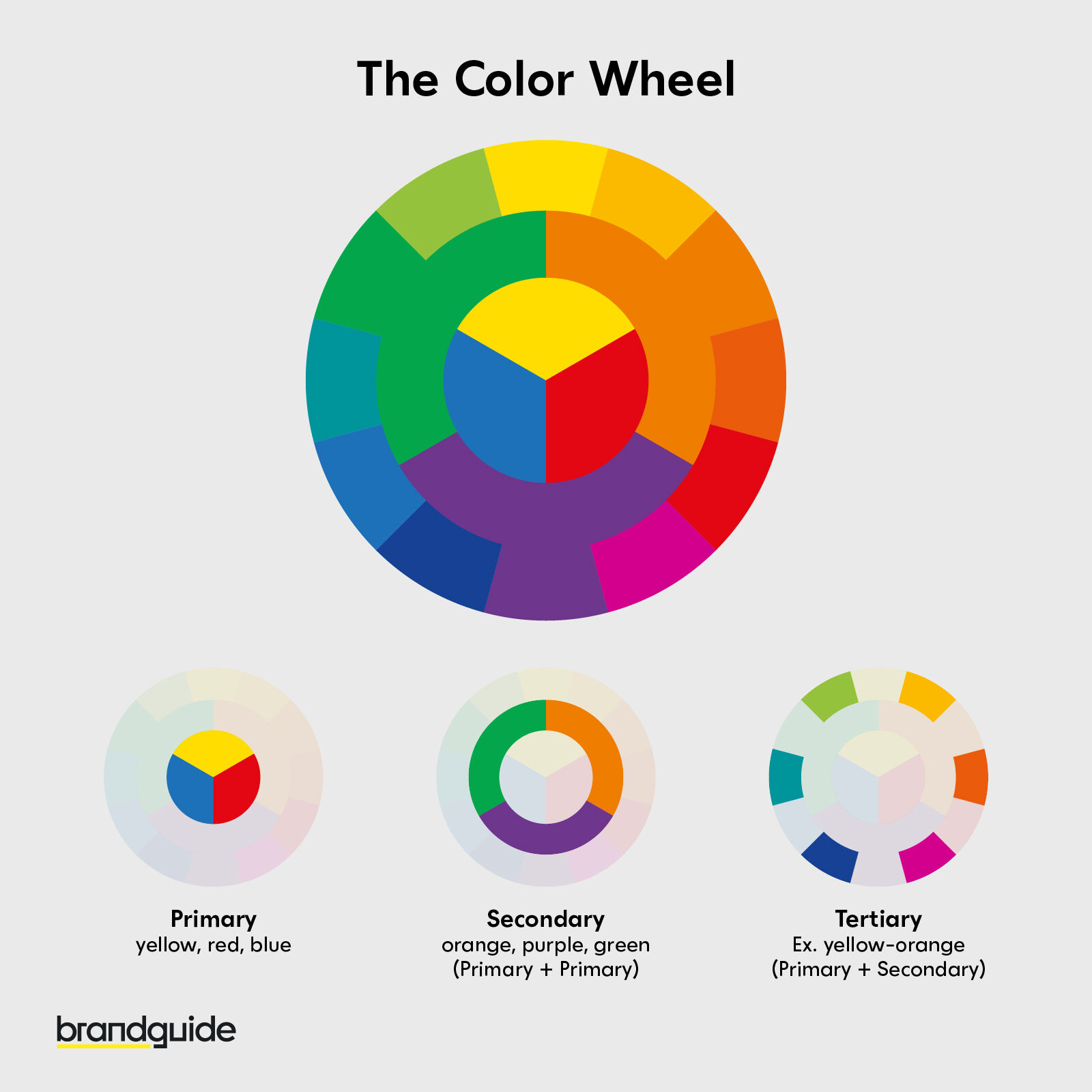
Our brains respond to colors on both a visceral and cognitive level. The color wheel is a foundational tool in color theory; it helps us understand relationships between colors, from complementary and analogous schemes to triadic combinations. Knowing the difference between hue, saturation, and tone is essential when you want to create a balanced color palette that appeals to customers.
- Dominant Color: The primary color that embodies your brand’s identity.
- Accent Colors: Typically 3–4 colors that highlight and balance the dominant color.
- Neutrals: White, gray, or black, which serve as a blank slate to enhance emotional balance and elegance.
Choosing the Right Colors for Your Brand
Define Your Brand Personality and Energy
Start by considering your brand’s core personality and the emotional energy you wish to project. Do you want your brand to exude passion and bold energy (think of the color of passion—red), or are you leaning toward a more serene and elegant feel, with shades like blue or purple? Your primary color should reflect these traits while also resonating with your potential customers.
(SEO phrases: primary color, color of passion, emotional balance, emotional responses)
Understand Your Target Audience
Different demographics and cultural groups perceive colors differently. American customers might have one set of favorite colors based on cultural cues, while international audiences may associate different emotions with the same hues. Conduct market research, surveys, or A/B tests to ensure your chosen color palette strikes the right balance for your customer base.
Practical Tips for Selecting Your Color Palette
- Audit Existing Colors: Identify any colors already used in your branding.
- Research Competitors: Note dominant color schemes in your industry and find a spot for balance.
- Experiment with Tools: Use Adobe Color, Coolors, or Canva’s color palette generator to create harmonious color schemes that combine your bold signature color with accent and neutral colors.
- Test and Iterate: Measure how different energy levels and emotional responses affect engagement on digital platforms.
Creating a Cohesive Color Palette
Building the Foundation
Start with a base color that defines your brand. This should be your dominant color—the one most closely associated with your brand’s identity. Add one or two accent colors to create contrast and visual interest. Finally, incorporate neutral colors (like white or gray) to serve as a blank slate that balances the overall look.

For instance, a modern tech company might use a deep, trustworthy blue as its primary color, accented by energetic orange or light green, balanced by plenty of white space to maintain clarity and elegance.
Ensuring Consistency Across All Platforms
Your color scheme must work seamlessly across digital channels, business cards, packaging, and even storefronts. Consistent use of color enhances brand recognition and ensures that your emotional associations remain intact regardless of where your customers encounter your brand.
Real-World Examples and Case Studies
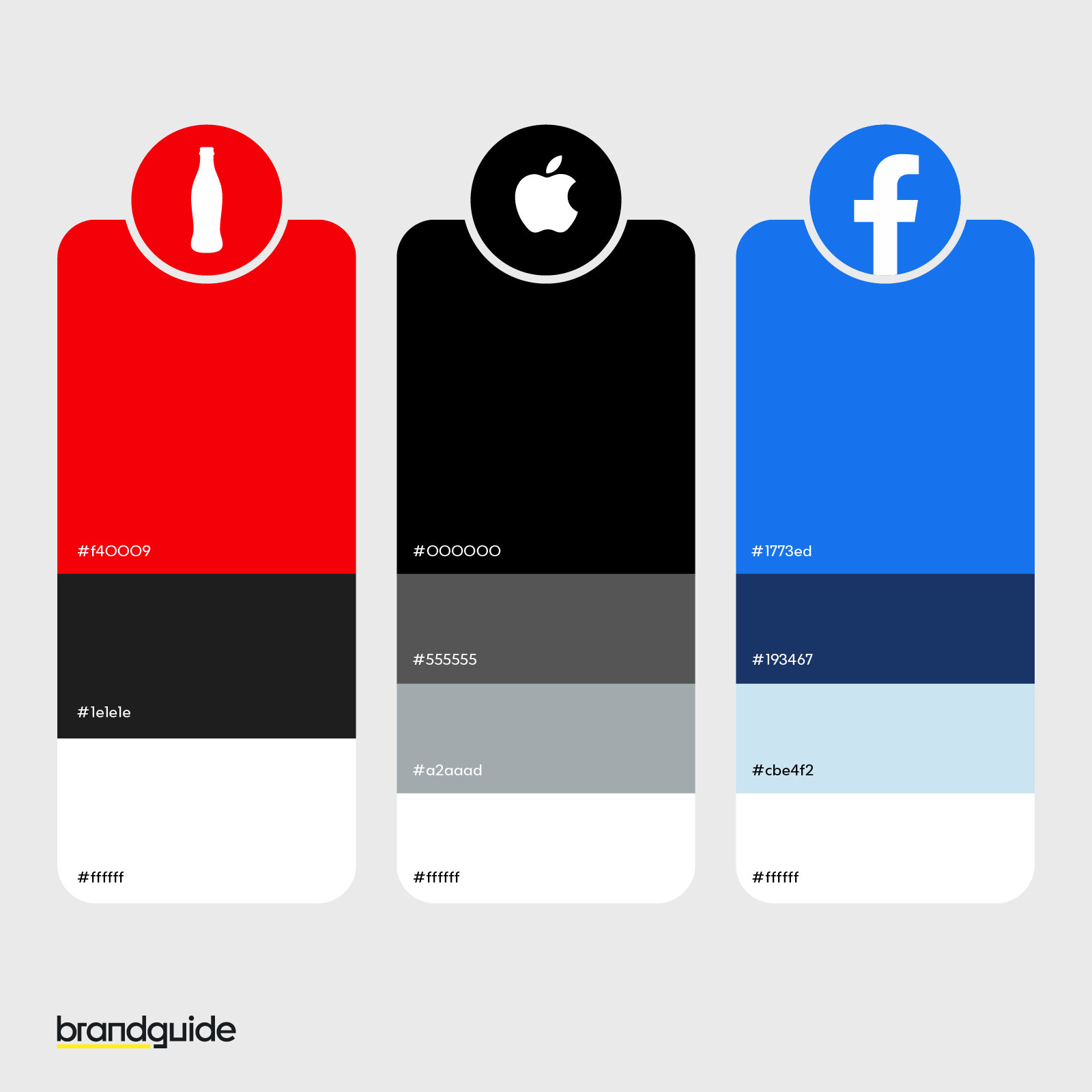
Coca-Cola: The Power of Red
Coca-Cola’s iconic red is more than just a color—it’s a statement of energy, passion, and boldness that has made the brand instantly recognizable worldwide.
Facebook: Trust and Calm in Blue
Facebook’s use of blue is synonymous with trust and reliability. The cool, calming blue exudes stability and appeals to customers on a subconscious level.
Ide lehetne a színes szürke érdekességet
Apple: Minimalism with Neutrals
Apple’s sleek design using silver, gray, and white creates a sophisticated, minimalist look that underscores its commitment to innovation and elegance.
Heritage Rebranding: Balancing Bold Choices with Consistency
When heritage brands like Jaguar update their color schemes—shifting from traditional hues to more modern palettes—they must balance fresh energy with the need for consistency that loyal customers expect. This delicate balance can transform brand identity while maintaining a connection with established audiences.

Color in Digital Marketing and UX Design
Impact on Website Design
Color isn’t just for logos; it plays a crucial role in website design. A well-planned color scheme can create a visual hierarchy that guides the user’s eye, enhances readability, and ultimately increases conversion rates. For example, using a contrasting accent color on call-to-action buttons can make them pop and drive customer responses.
Visual Hierarchy and User Experience
The proper use of colors creates a clear structure on your website, ensuring that visitors can easily navigate and absorb your message. Balancing vibrant hues with neutrals contributes to a harmonious and engaging design, making the overall user experience more intuitive and enjoyable.
A/B Testing for Color Optimization
By testing different color schemes (using A/B testing), you can determine which palette generates the best response from your target audience. Track metrics such as time on site, click-through rates, and conversion rates to fine-tune your colors for maximum impact.
Balancing Emotional Resonance and Functionality
Creating Emotional Associations
Your brand colors should evoke the desired emotional responses—whether it’s the high energy of a passionate red, the calm of a cool blue, or the creative spark of a bold purple. The right mix can elevate your brand identity and help potential customers form a personal connection with your business.
Practical Strategies for Color Combination
A popular approach is the 60/30/10 color rule:
- 60%: Dominant base color that defines your brand.
- 30%: Secondary color that complements and enhances the base.
- 10%: Accent color for emphasis on key elements like CTAs or icons.
This rule ensures a balanced, visually appealing design that can guide customer attention without overwhelming them.
Accessibility Considerations
Ensure that your color choices provide sufficient contrast, making your digital and physical materials accessible to everyone. This not only improves user experience but also reinforces your brand’s commitment to inclusivity.
Conclusion & Next Steps
It’s clear that color is much more than just a visual element—it’s a strategic asset that infuses energy, elegance, and emotional balance into your brand. By leveraging the principles of color psychology and carefully applying color theory, you can create a cohesive palette that not only captures attention but also builds trust and resonates with potential customers.
Take the time to experiment with different color schemes, test your choices with your audience, and refine your palette based on feedback and performance metrics. Your brand’s visual identity is a powerful communicator—make sure it speaks with clarity, consistency, and passion.
Ready to transform your brand with the perfect color strategy? Subscribe for more insights, share your thoughts in the comments, or reach out for personalized branding advice. Let your brand’s colors shine as a bold signature that truly represents who you are!